‘Bout time for a little change around here! ^^^
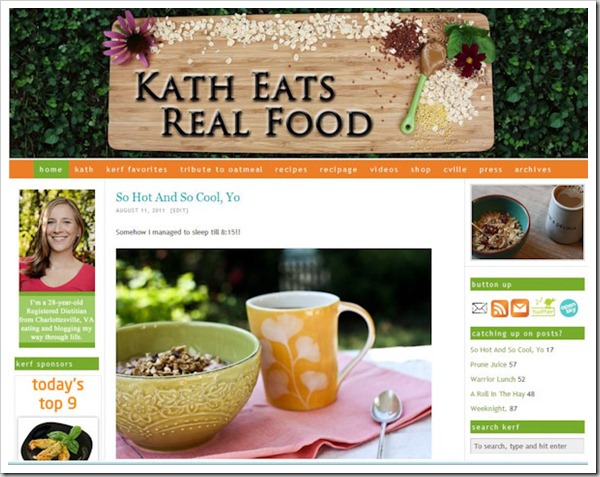
The old…
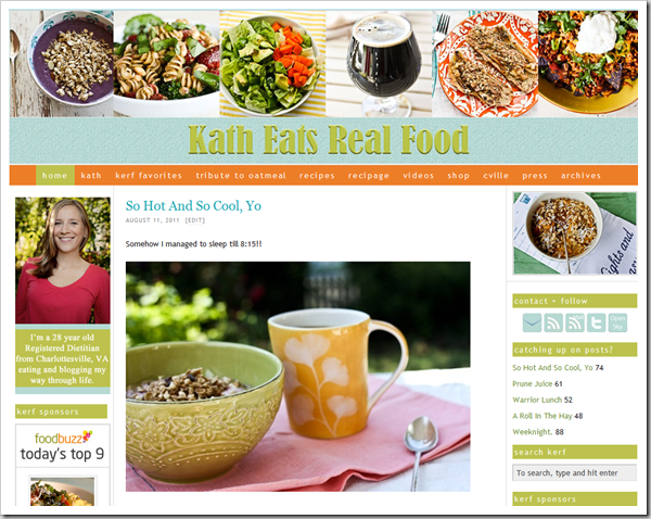
The new..
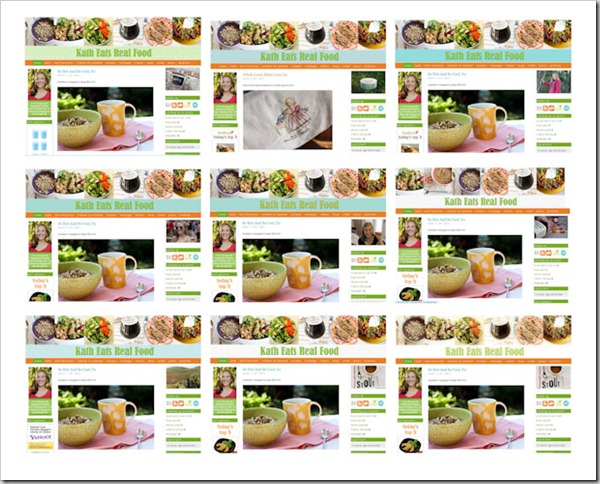
I haven’t been all that happy with my header since Day 1, but other times I’ve tried to change it people have said it “wasn’t me.” I really wanted to do something vintage and lose the vivid photos, but it seems KERF is defined by vivid photos!
Lots of trial and error later, a compromise was met! Vivid photos + “vintage pea” color palate change and linen texture = antique modern style. I think it suits KERF well, so I hope you do too!
[Here’s the vintage look I really wanted but Matt said it was too muted and didn’t mesh with the rest of my images. Still love it, but I have to agree with him:
I worked and worked straight through until 2pm when I figured it was about time to take a break for a run!!
4 miles later, and very thankful it was ONLY 83 DEGREES OUTSIDE (!!!) I returned for a refreshing glass of H20 and lunch.
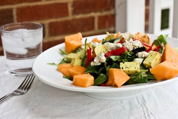
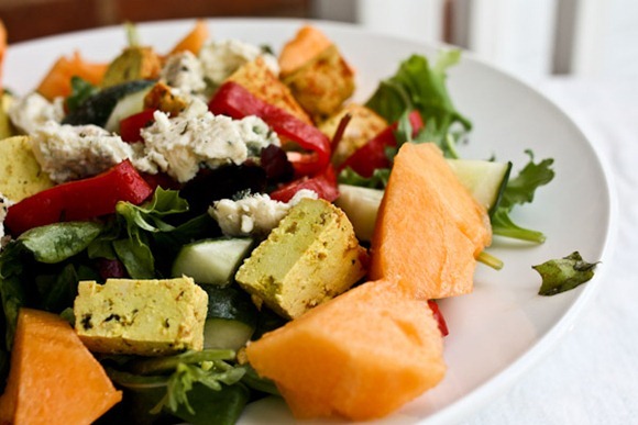
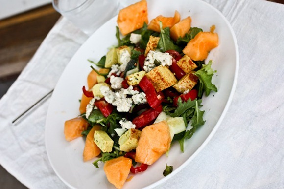
I made a salad with greens, peppers, cuc and tomatoes and topped it with raw Spicy Thai tofu. There was no need to dirty up a pan and cook it. Get in my belly.
Other toppings included cantaloupe and blue cheese, which rocked! Dressings were coconut oil and Pumpkin Balsamic from Boston Olive Oil Co.
El Tigre says hello!!
Still haven’t taken a shower today…because I’m supposed to mow the grass!! It’s gonna be itchy out there…






Krissy @ Shiawase Life says
Looks great! And PUMPKIN balsamic? OMG sign me up…
Lauren @ Lettuce Eat Cake says
Looks awesome, Kath! I always think of your style as somewhat vintage but modern (like your decorating style!), so I think it’s perfect. You have craving delicious tofu, as well. 🙂
Sylvia @ My Attempt at Balanced Living says
I love it! The header is very fresh and I agree it is very you. Vintage meets modern is a good look for you 🙂 Have fun mowin!
Kristen @ Change of Pace says
I love your other header only because it’s creative. However, I think this fits your blog better… Looks great!
Ashley @ Feeding Ashley says
I really liked the old header, but this one is even better!
Ann @ Day by Day says
I really like it! I love how all the bowls of food flow together.
Allie (Live Laugh Eat) says
Looks fabulous. I agree with Matt, vintage is not as pretty.
Katie @ cooklaughmove says
I love the look!
I ventured into Big Lots today and discovered BISCOFF for only $2!!! I had to try some and *swoon* fell in love. Almost wish I’d never bought them, they are so good!
Kayla [once upon a lens] says
I really like it! Of course, it took me a few seconds to get used to it, but I really like your new header, Kath! The colors are perfect.
kaila @ healthy helper! says
I liked the old header a lot! Something about it! But the new one looks great too!
Baking N Books says
“Vintage vibe” . And “colorful photos”. That’s exactly what speaks to your blog. I agree with Matt as well, the other was more muted.
Kori says
Your new modern-vintage header suits KERF perfectly. 🙂 I had to mow the yard today too. I hope you can finish quickly & then enjoy a nice shower! I look forward to reading your evening post about your dinner date. 🙂
Angie @ Musings of a Violet Monkey says
I love the new header. It seems more “you” than the old one, IMHO. I like the extreme-vintage one too, but I agree – it doesn’t seem to fit with the rest of your photography. (I’m all about vintage/modern… and am currently coveting a light fixture made from vintage Ball jars).
~
Jules says
I love it, although I have to say, when I looked quickly, the last picture on the right looked like a chocolate frosted sprinkled doughnut! (Not that there’s anything wrong with that…)
Josh says
I like the photos for the new header much better than that old wooden board with the oats. I think you should change the font and color of “Kath Eats Real Food,” though, because it’s pretty difficult to read and doesn’t have the prominence I think it needs. Something more contrasting in color and a font that’s not so scrunched up together. Maybe big/small caps, like the previous title?
KathEats says
I appreciate the feedback, but I think I’m going to keep it for now.
veganlily says
That is EXACTLY what I thought also! Love everything (and think it’s an improvement for sure) except the font, color and lack of small caps on the “Kath Eats Real Food” – so weird to me that someone had the exact same comment! Either way, it looks great – nice work. You have an artist’s eye.
Betsy says
I LOVE the color scheme – the middle FOUR photos are not appetizing at all, but that’s just me. I’m not a beer girl, though!
Vicki says
I love the collage of images, but have to agree that the typography could use a little work. ‘Kath Eats Real Food’ just doesn’t stand out, and I think if you were new to the site, it wouldn’t be immediately clear where you were.
Your photos are beautiful though, and whilst I love the ‘vintage’ one, I agree with Matt that this one is better suited to your photographic style.
Averie @ Love Veggies and Yoga says
Congrats on your new header, Kath!!
Headers are sooo personal, can be so tricky, the colors, the elements, the placement, width, size, retro, crisp, vintage, modern, interfacing the graphics with other site functionality things…yes, they are their own little “project” and congrats to you for knocking it out! And coming up with a great header!
Glad you’re happy!
Morgan @ Some Kind of Sunshine says
Look Fantastic! I love it.
Abby @ Abz 'n' Oats says
I think they new header looks great! 🙂 Plus, it is YOUR blog so you should do what makes YOU happy! Hope you have a great day!
Cait's Plate says
I’m partial to the vintage-y photos too but I definitely see what Matt is saying. I feel like it fits your life and all the cool antique things you have (bowls, spoons, cloths, distressed tables!).
Also – PUMPKIN balsamic!? That sounds incredible. I’ve never tried raw tofu – did you eat it cold? I wonder if I could get into that…
KathEats says
Yup, just cold
Marie@feedingfive says
I love your new header, but I loved the old one too. Your husband’s right, the color brings a vibrancy as do all your gorgeous photos.
Lucky me my 10 year old is in charge of mowing the lawn.
Jennifer G says
love it!! although that top right photo looks like a donut at first! 😉
KathEats says
I didn’t see it at first, but now I do!
J3nn (Jenn's Menu and Lifestyle Blog) says
I like your new header! Would you believe that I’m doing something similar for mine right now? haha Well, the picture + text location is the same. Good job! 😀
Clara says
Is El Tigre okay without his tail? (He has lost it, hasn’t he?) Tell him he needs to take better care of his other 6 lives!
KathEats says
I think so!
Freya (Brit Chick Runs) says
I love it! Definitely my favourite 🙂 BUT – no bowl of oatmeal in the header!? Oatmeal IS KERF!! well, there’s a lot more to it too, but you made me love oats 😀
KathEats says
I CHANGED IT!!
Liz says
Love the new look! I think it is fun and upbeat, which is how I think of your blog!
Katherina @ Zephyr Runs says
The header looks great!! Love it.
Christie @ Running Through Peanut Butter says
Yum! Your salad looks delicious. I should try adding cantalope to a salad.
I also love your new header! I just started my blog and no header yet.. but one of these days, I’ll make myself a cool header too!
Gina @ Running to the Kitchen says
I think it looks great! I love how vibrant your pictures are, I’m glad you kept them in.
LatteLove says
I think Matt was right on the vintage editing of the photos. Like the new header! Gives a better feel for what you usually blog about 🙂
Kate (What Kate is Cooking) says
I like it! I’m trying to work on a new header- I hate mine!
leslie says
I think it looks good, but like the old better! It was so unique, and so you. Whatever makes you happy, though!
Heather @ Get Healthy with Heather says
Love the new header! Vibrant pictures are definitely your thing.
Christina says
Kath, I love the new heading, but you really, really need a picture of your signature dish–OATMEAL!
Jess says
I love the new header, it is lovely looking food and sums up your blog totally.
I hope you are having a great day.
Love Jess xx
Amanda @ a fattie to foodie says
I really like the snazzy new header! Nice job!
Alaina says
I’m loving the header too! You take such phenomenal pictures. How did you choose the ones to use?
Love it!! 🙂
Meaghan O'Connor (My Spoonful of Inspiration) says
I love the new header! It usually takes me hours to decide on my headers, I just recently switched mine up too! It feels nice to change it up every once and a while. 🙂 I like how you feature some of the best parts of your blog- the food pictures!!!
Your dressings sound so interesting and different- pumpkin balsamic? It sounds so unique and bold! 🙂
E says
I loved your old header, but the new one is really cute, too! It’s definitely ‘you’ 🙂
Shannon @ My Place In The Race says
I love the new header! 😀
Cathy says
What’s a header? I am not computer savy. I see there is 9 pics of the iced coffee & oatmeal.
I am still hoping to find out where to purchase the mugs.
KathEats says
The design images and title at the top
Jane says
Love the new header….and love that kitty! 🙂
amanda says
I really like the new header, but I have to agree with Josh — it’s really hard to read the title. Granted, I’m colorblind so I struggle seeing color-on-color logos, but it’s almost invisible to me!
Christena says
I didn’t like the last header, but this one is beautiful! I think it is perfect and looks fantastic!
Lauren @ What Lauren Likes says
Nice new look! and bomb looking salad 🙂
Estela @ Weekly Bite says
LOVE the new look! Vintage is the way to go 🙂
CJ @ http://healthy-happy-whole.com/ says
I noticed the change earlier and think they look great!!! Ive always loved the site but this is even more inviting than before!
Eileen says
love it!! The colors look so fresh and the photos in the header are so inviting!
Good luck with the grass mowing – at least you have a cool day for it 🙂
Christin says
Looks great Kath!!
I finally published my own blog if you ever want to check it out…not nearly as cool as yours, but it’s there 😉
Cheers!
Kelsey says
looks ggggggggreat! I am also currently in the no shower club..
lynn @ the actor's diet says
love the new look! though i always liked the old one too…
Emily @ One Sweet Vegan says
I like the new header! 🙂
Ellie@fitforthesoul says
Kath! The header looks beautiful! I really like the old one too though! 🙂 I think the vintage one looks fabulous, but for some reason I just see you with eye popping colors–perhaps b/c I’m used to it? Haha.
Shayla @ The Good Life says
Love love the new header and I love the “vintage” look and the “vintage pea” color! And I agree that you need your photos in the header, that’s one of the things I love about your blog…not only do I love your writing and thoughts, but your beautiful food photos!!
And I love the new color of your reply box in the comments section…the bright green was nice but this is even better and smoother on the eyes 🙂
Lindsey says
Love the new header and the photos! I think it is perfect 🙂
Chelsea @ One Healthy Munchkin says
The new header looks great! I love the vibrant pictures.
Lauren says
I really do love the new header but I also liked the old one. The new one is definitely more appealing on a creative and artistic level and I think most of your readers will be drawn to it.
Jen @familyfoodfitnessandfun says
Love the new header!
Molly @ RDexposed says
Way to go on showcasing beer. Did Matt make sure that made the cut?
Kristin @ STUFT Mama says
Love the new header! 🙂 It looks great! Hope mowing the lawn goes well.
Kristin @ eat healthy. be happy. live well. says
I loved your other header, but this one definitely screams KERF!
Nancy-The Wife of a Dairyman says
LOVE, LOVE, LOVE your new header! Great look!
And pumpkin?! Funny, I was just feeling a touch of fall here in northern California today….a little chill to the air, I’m so looking forward to it!
Tessa @ Amazing Asset says
Looks great Kath! I really really like it 🙂
Mary @ Bites and Bliss says
Love the new header but I really did like the old one, too. This one’s much brighter!
Hannah says
Looks lovely! I desperately need to change my blog’s “look” too, but I lack the technical know-how 🙁
Cait @ Beyond Bananas says
LOVE love love everything about the new header, Kath!
Hillary says
The new header looks phenomenal, Kath. Those pictures are so YOU!
Katie @ Peace Love and Oats says
my favorite part of the new header is that the beer is prominently displayed in the center! Haha. Very pretty collage though!
Ali @ Peaches and Football says
I really like the new header! You did a fantastic job with it!!
sally mae says
I love it and think it looks great! It’s hard to not want to follow the vintage trend (I know I am surely guilty…;), but your photos are great so I am glad you stayed true to YOUR style!!!
Dee says
I love the new look! Love the color palette too!
Bekah says
Love the new header! Great job 🙂 And yeah for some cooler weather to make running outside more bearable…
Ma Fea says
Cantaloupe and blue cheese?? GREAT IDEA!!!!! I love pears stuffed w/ blue cheese–can’t wait to try it with cantaloupe!
Stella says
Looks good. Be happy. 🙂
kris (everyday oats) says
Loving the new look! 🙂
Living, Learning, Eating says
The new header is lovely! And it’s definitely better than the super-vintage one 😛
Ashley @ Coffee Cake and Cardio says
I love the new look!! It is very KERF!! LOVE
Lauri (Redheadrecipes.com) says
I like it, but the font doesn’t seem to ‘Pop’. I wonder how the font from the old header would look?!
KathEats says
I couldn’t get the other fonts to look as 3D as this one..so that explains the choice
Stacy @ Say It With Sprinkles says
Your blog is beautiful either way, but I know how nice it is to switch things up once in awhile!
And of course, El Tigre is cute as ever! =)
katie @KatieDid says
I’m a big fan of the change. I go back and forth when I’m editing photos, because I do love that 1960s vibe when I wash them out a bit, but crisp and colorful is always a good choice too. I think you made the right decision with the general vibe of your blog.
Honey says
Hi Kath!
Love the new header. My only quip is that your title doesn’t quite stand out. Perhaps a brighter color (or subtle background color) or larger size would help??? Have a great one!
Rebekah @ Medicine, Munchies and Movement says
I enjoyed your old header but I LOVE your new one. It looks fantastic!
Ash @ Good Taste Healthy Me says
Like the new look. Yay for El Tigre. Haven’t seen him in awhile!
The Healthy Apple says
Love the new header, Kath! Looks beautiful and such amazing salad pics today…mmmm I wanna bite of that!
Angel7 says
I like the new look of the site!
http://faithfulsolutions.blogspot.com/
Maria @ Beautiful Busy Bee says
I love your new header!!! The old one was awesome but sometimes I guess you’re just ready for some change! I actually came up with the idea for my blog’s header BEFORE I chose the title. It inspired the title. 🙂 I love how now there’s food porn at the top of the blog.
Jessica says
I like the new header! Inspires me to update mine. 🙂
Emma says
I really like where you are going with your new header photo line! There is however a slight issue for me: my eyes strain because the colors in your photos are so much brighter that the colors in your blog name line. You might want to consider finding a better balance between the two.
Kathleen @ KatsHealthCorner says
I LOVE YOUR NEW HEADER!!!!! 🙂
Samantha says
I like the header too, a nice showing of your yummy real foods, but I don’t like how some of the photos are cut. I really liked the old one…the nut butter on the spoon especially:) I’ll come visit you any day no matter what your header looks like! XO
Sara says
Love the new header!
Khushboo says
Loved your old header and loving the new one too 🙂
Janie says
One of my favourite things about your blog are the photos that ‘pop’! The vintage style header totally lost that pop so the compromise certainly works for me! xx
Lexi @ A Spoonful of Sunshine says
I really like the pea green accents around the blog’s sidebars.
Since we already have a Mama Pea, maybe we’ll have to start calling you “Sistah Pea” or “Pea-KERF”?
KathEats says
Sistah Pea – hahha!
Laura says
Love the new header, but I thought the old one was fab too!
What programme do you use to design the header/ how did you create your site design and website?
Do you have any links to posts which highlight what methods you use?
Thanks
Laura 🙂
KathEats says
I edit them through my WordPress Dashboard using my custom.css file as well as the Thesis Options panel, and I did the header in Adobe Lightroom and Photoshop. 4 years of blogging = a lot of trial and error!
Laura says
Thanks, Kath.
I’ve recently bought Photoshop and am looking forward to experimenting more!
x
haya says
like the new look! my only general complaint (as a bit of a typography nerd) is that you seem to have a lot of different fonts/styles of text around the page that make things look a little cluttered and i feel that your style is more sleek than that!
natalie (the sweets life) says
I see Matt’s point about the vintage photos not matching your other photos but I personally loved them—if you want to change to a vintage header, I won’t complain 😉
Callie @ The Wannabe Athlete says
I must have missed this post – whoops! Looks great anyway. 🙂
Jessica says
Hi Kath! I like this look a lot better too, and I also wanted to give my two cents (if only you really received 2 cents!) that I LIKE the font!! (and there are no laws to graphic design!)
I kind of think of your style as vintage shapes and patterns, but with modern colors! very cool.
KathEats says
I do too : ) thanks
Emily @ www.emily-eats.com says
Love the new style! Just started my own blog, check it out!
Kiran @ KiranTarun.com says
Out with the old in with the new!! So loving this new look Kath 😀
Lisa Fischoff says
I like the new look! and I see you’re loving that aged photo preset 🙂
KathEats says
Actually this was a different one from Photoshop, but yes, I love that look!
Becca says
I am a little late commenting, but I am a bit sad to see no picture of a big hunk of bread in your header! I was totally expecting to see some more bread (seeing as it is now a big part of the blog).