Now that we have the architecture plans finished, it’s time to focus on finishes! Here is the inspiration we’re using for a modern coastal farmhouse mood board in our new house.
Modern + Coastal + Farmhouse
You’re probably not surprised by the title of this post or the design direction we’re going for the renovation. (More on the renovation plans here.)
Whenever I tear pages out of a magazine or browse Pinterest, I am drawn to both coastal and farmhouse decor.
Coastal for its easy breezy white backdrop with cool muted blues and greens peppered with natural elements.
Farmhouse for its classic black and white palette with elements of rustic texture sprinkled throughout. (more on farmhouse here!)
Modern because I also like a clean, uncluttered, new feeling verses the antique dark house I grew up in : )
I really like a neutral backdrop with pops of color that I can change seasonally and/or when I get sick of them.
I want our home to feel classic and spa like.
Luckily Thomas and I have the SAME style, which is quite convenient! (You can see this in our porch renovation from a few years ago.)
When we share photos of what we like and dislike, we are always on the same page. (And we don’t always agree on everything in life, especially as two hard-headed people!)
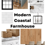
Modern Coastal Farmhouse Mood Board
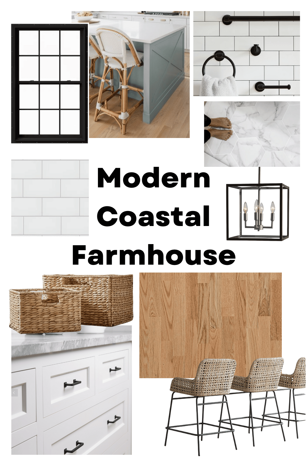
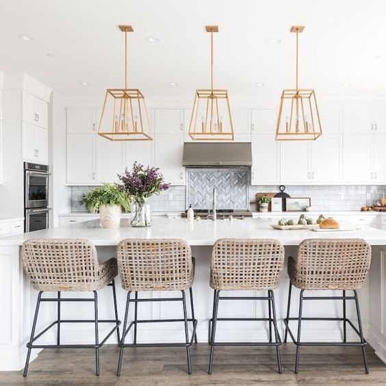
Barstools | Pendant light | Hardware | Baskets | Backsplash tile
White walls (YES!)
Some call it boring or cold, but I call it clean! I actually overheard a woman at the salon say “I could never paint my whole house white.” I laughed because that’s my goal!
Our entire house is gray right now – the exterior and all 3 floors of walls. I like gray (our main floor is the color Agreeable Gray by Sherwin Williams) and I like it, but if we’re going to start over I want everything to be white. I’ve been known to paint a wall a color (like my first house) and then re-paint white!
White trim
This is a no-brainer to me 🙂
Black windows
Getting new windows is a huge priority for Thomas (along with making the house more air-tight in general). For this reno I’ve been talking about storage and space and all he can focus on is insulation and quality windows! As a custom builder, he looks way beyond the finishes. While we’re getting better windows and insulation, we’re switching to black!
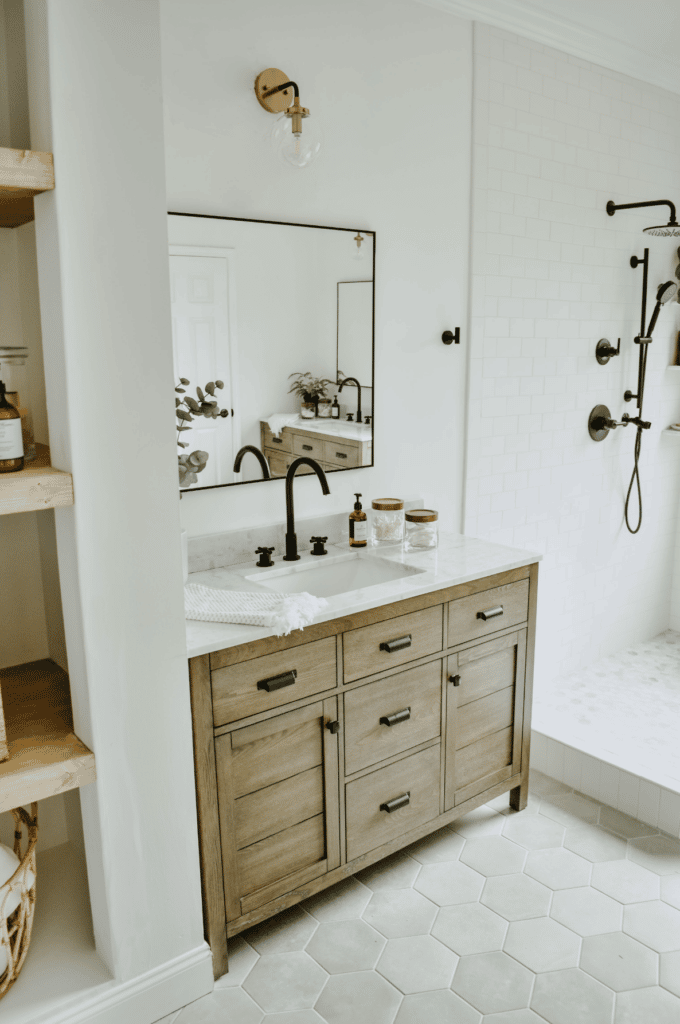
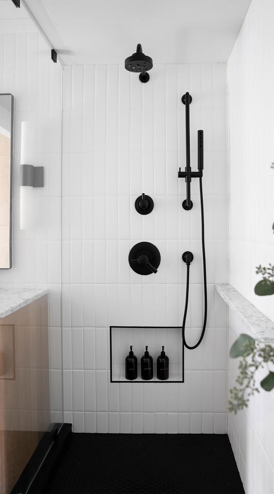
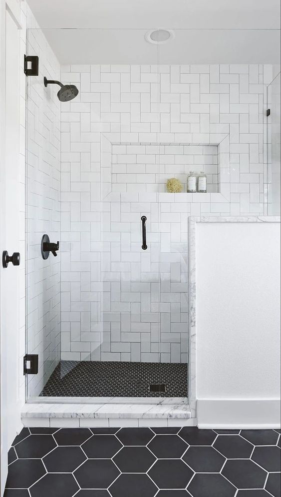
Black hardware
Brushed gold is very on trend (see the first photo in the inspo gallery below!) but I fear it will get dated quickly, so we’re planning to go with classic black.
Natural wood hardwoods
The floors in our house are dark brown mixed with orange. I don’t hate them, but Thomas would like natural hardwood. Since we’re moving out and having to stain the floors in the addition, we’re going to do the whole first floor while we’re at it rather than try to match a color we don’t love.
White inset cabinets
I am learning so much about houses! Inset cabinets have the drawers go into a cubby verses overlay cabinets have the fronts close onto the base. (Learn more here!) Almost all of my inspo photos have inset, so that’s what we’re hoping to get. We may mix in some color to the island, but I am just so color phobic for long term that we’ll probably do white for the kitchen perimeter.
Marbled quartz counters
When I did the kitchen counters in my old house I did enough research on materials to know that quartz is the only way to go. It’s the most durable, and I can’t stand the thought of a blemish or stain on a countertop. I have disliked the granite counters in our current kitchen since I moved in, but I never wanted to rip out something new. Now that they’re 7 years old, I can’t wait to get something much more my style. (And not the sparkles I put in in 2013 – haha).
White tile backsplash
This is a decision we’ve been rolling around. I hate to be boring with white subway tile again. But when I look at all the kitchens that catch my eye on Pinterest, they ALL have white backsplashes! We may try to get a little creative with the tile size or perhaps the install pattern, but my eye just likes the organization of horizontal rectangles. TBD if we go with white or charcoal grout! That’s another huge debate. We want white, but our gut says go dark!
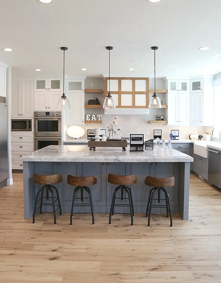
Accent paint color on the island in a coastal blue/green
Are you surprised there might be a splash of color!? I think the island is a great spot to do it, and lots of my pins have blue islands.
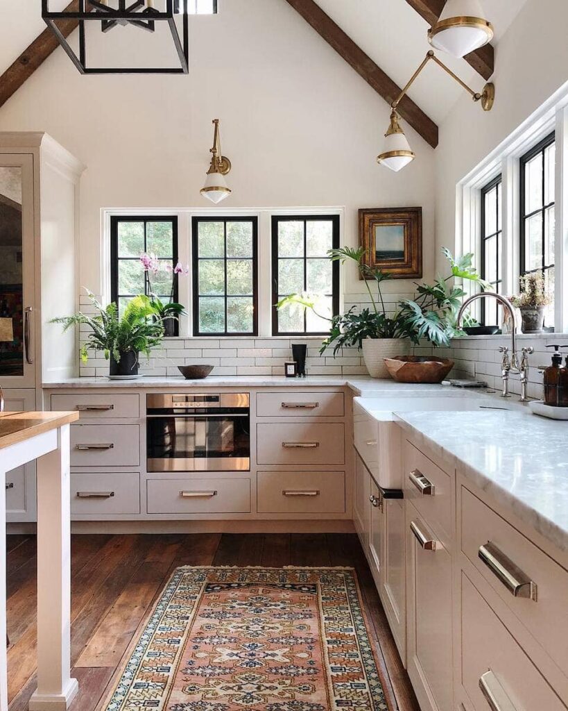
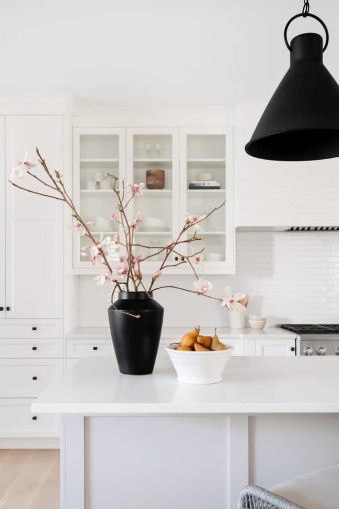
Kitchen Inspiration Photos
Here are photos and links to their creators that have been inspiration for us in our design!
Cozy and Kin
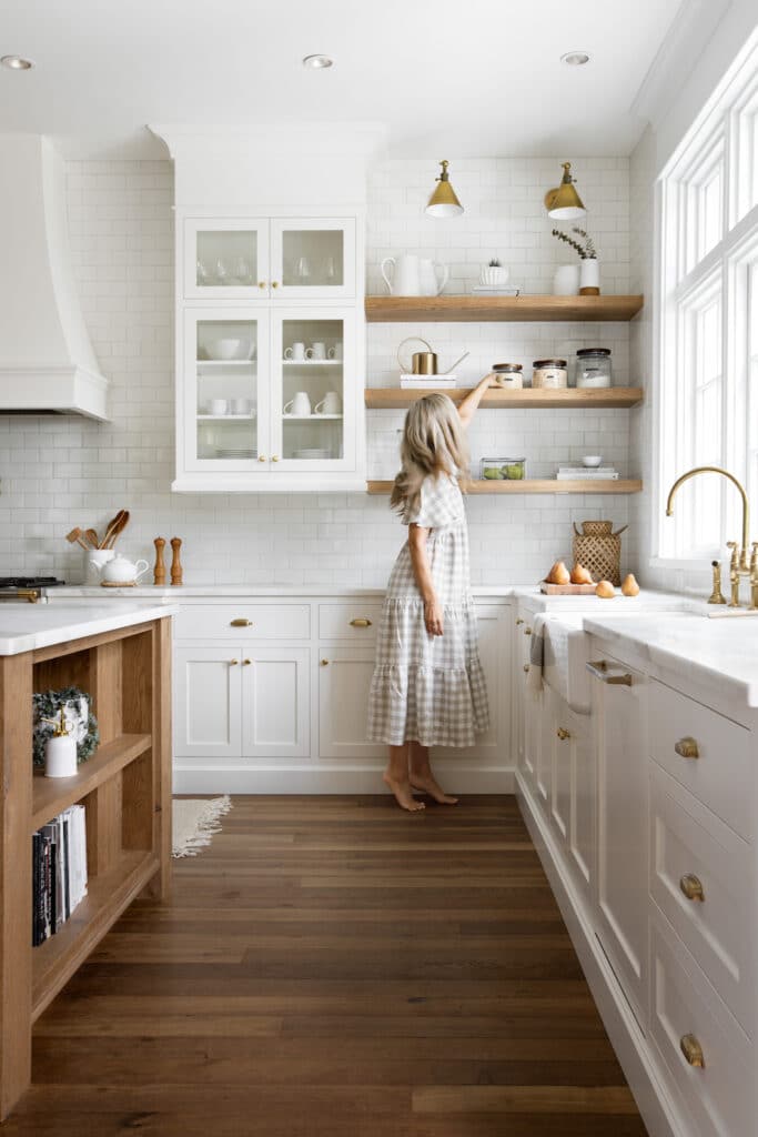
Via Amazon
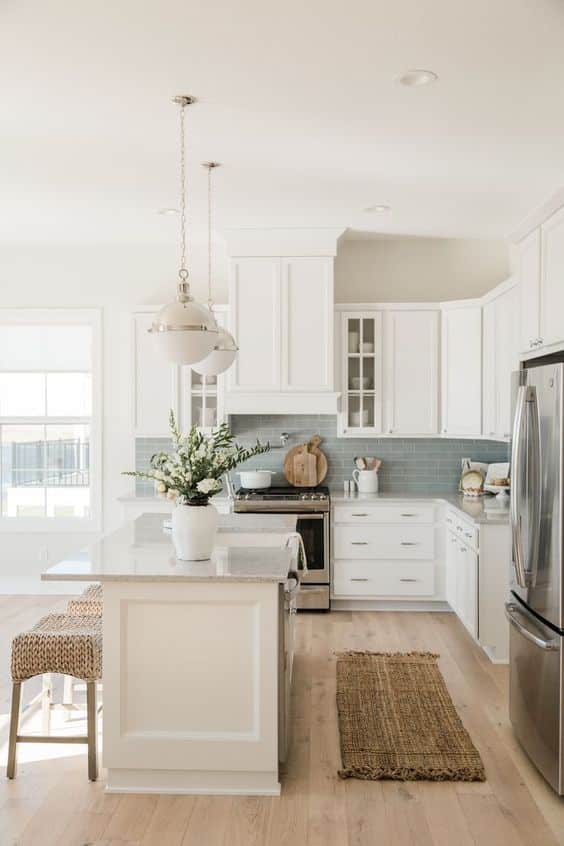
Black B and Design
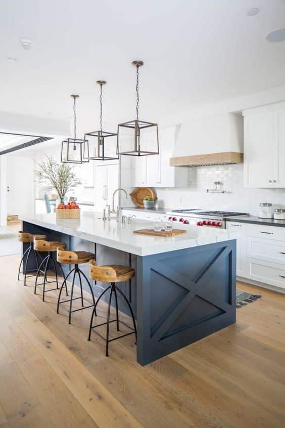
Via Ballard Designs
The Creativity Exchange
Meg McSherry Interiors
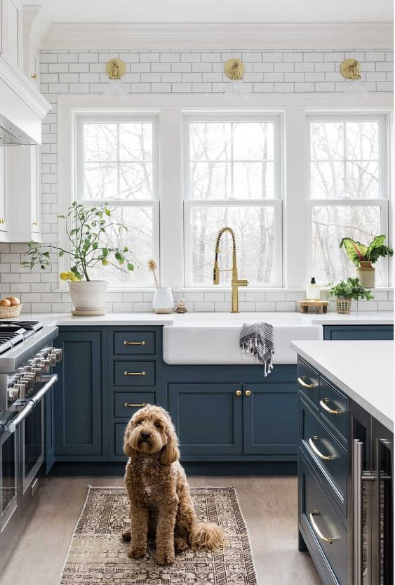
Rue Mag
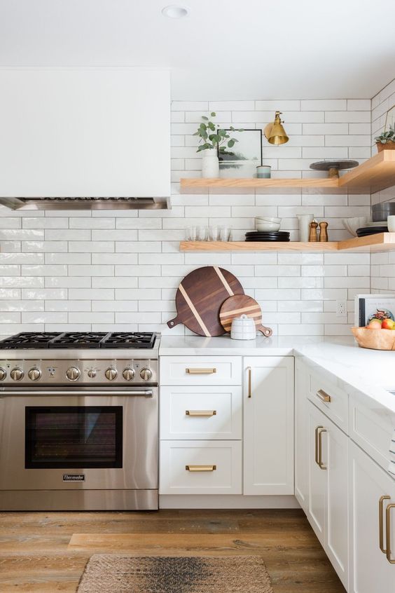
Maison Blonde
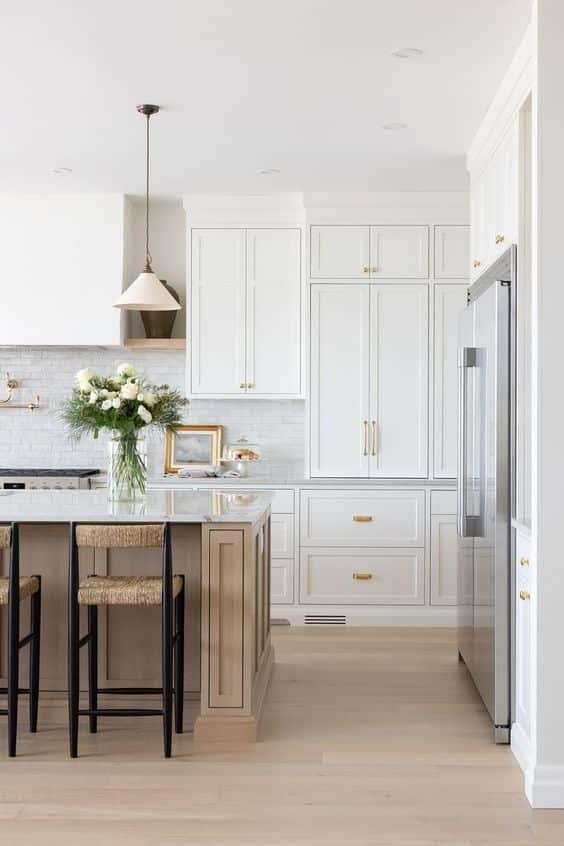
Oh Sweet Basil
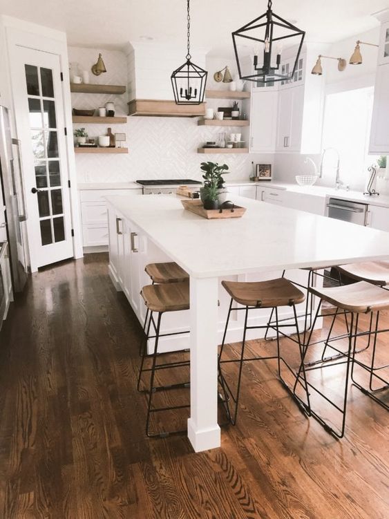
Farmhouse Living
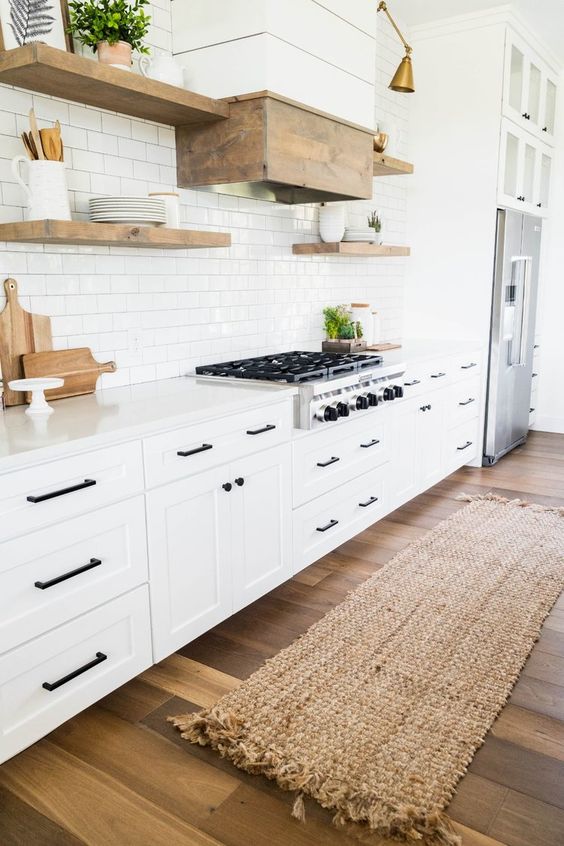
Green Door Home
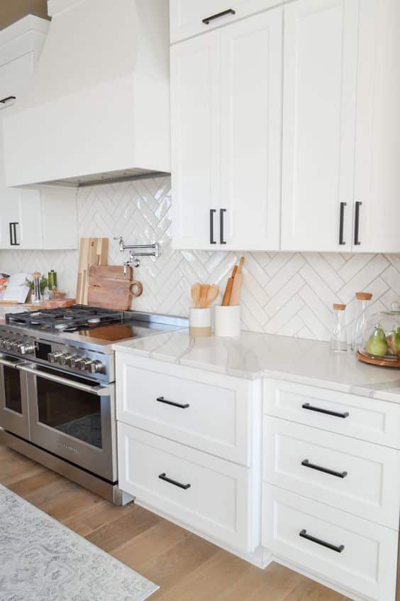
Sparrows and Lily
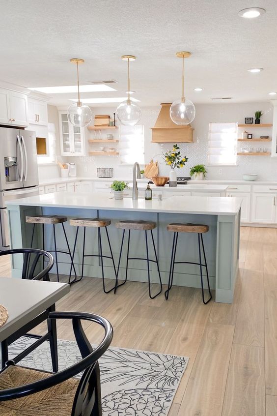
Pantry + Organization Inspiration Photos
Kowalske
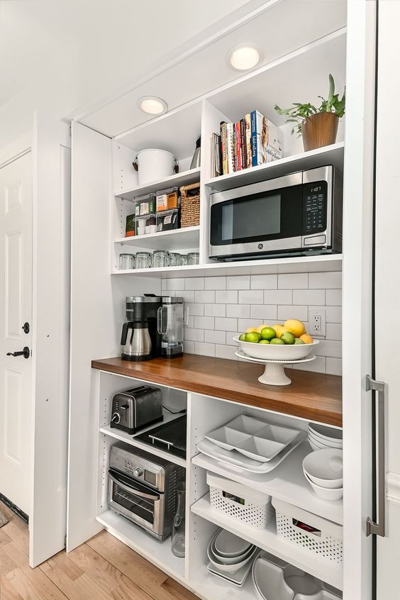
Style Blueprint
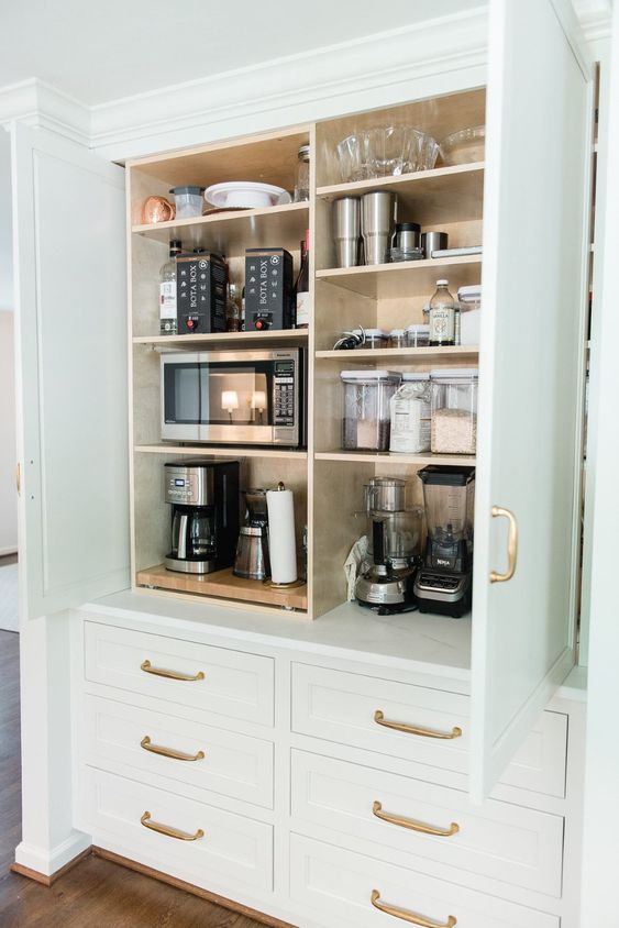
Real Simple

Poulin Design
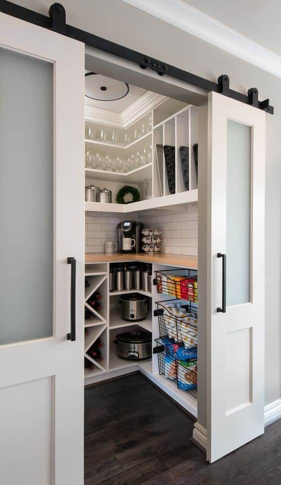
Rue Mag
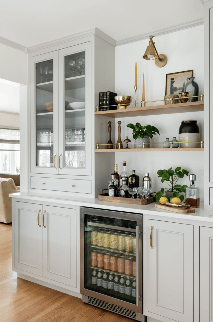
Master Brand
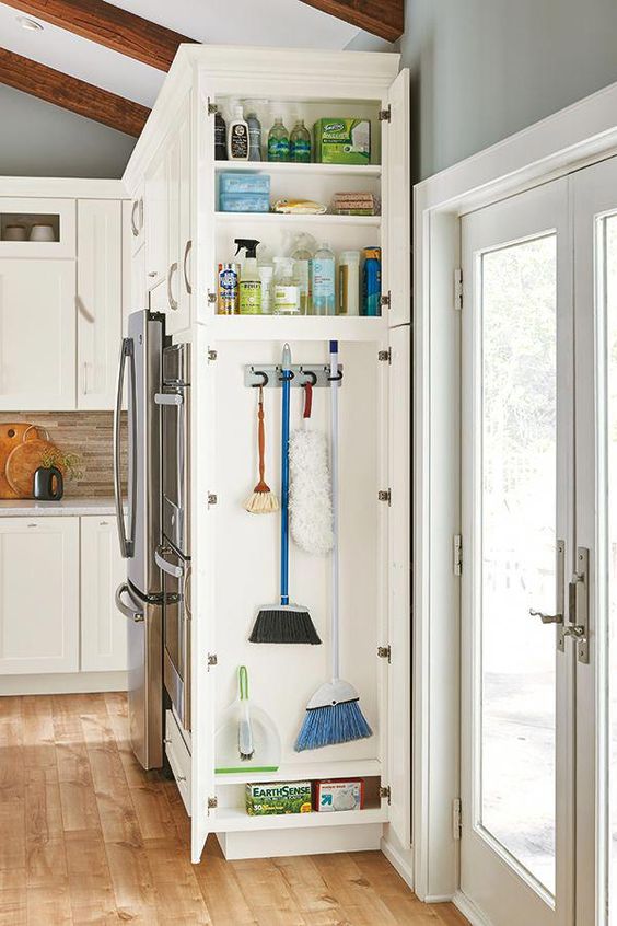
SBK Living
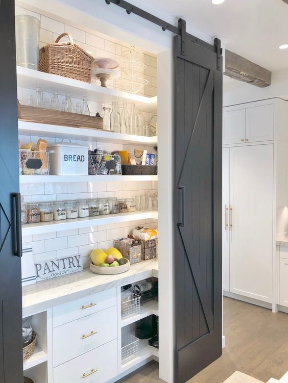
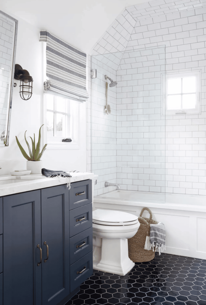
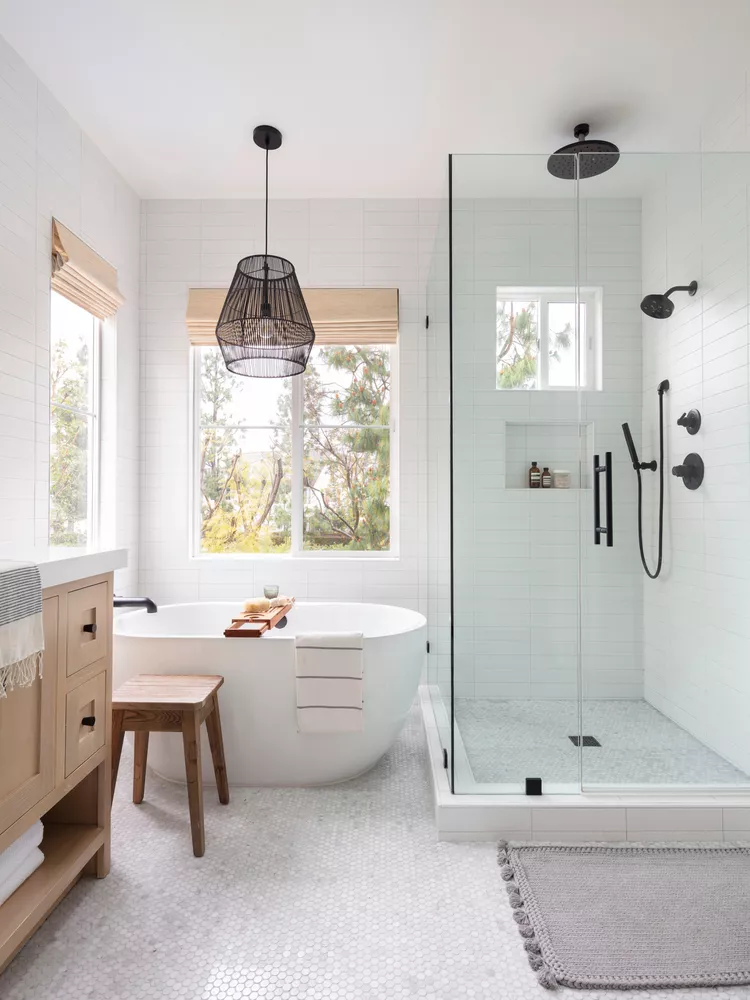
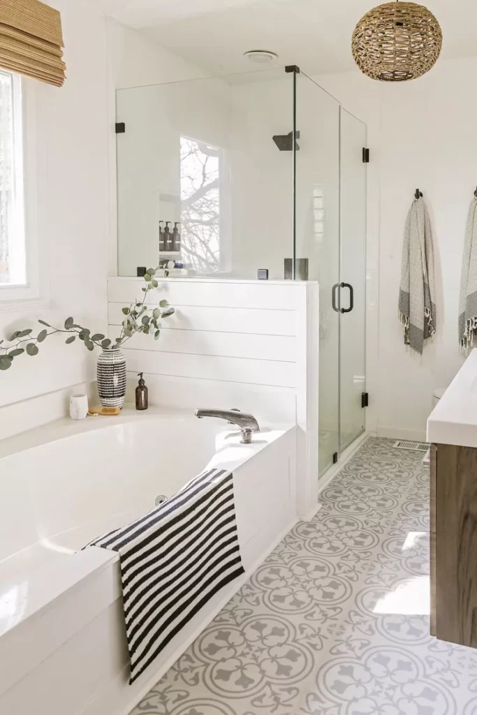
Bathroom Inspiration Photos
Driven By Decor
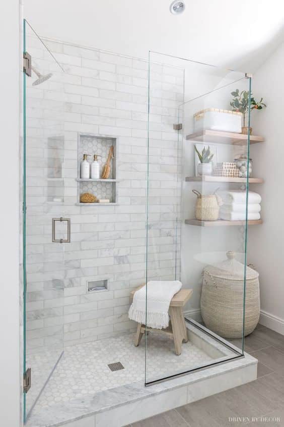
House on Longwood Lane
Builders Design
Daleet Design
Tile Club



Nancy says
Your inspiration pics are all so pretty! We’re building a new house and it’s juuuuust about done. We went with white cabinets and a dark blue island (Marsh cabinets “Hatteras” blue) – I love the pop of color!
Kath Younger says
Love! Send me pics!
Bobbi McCormick says
This is what we did too. I have most those pics pinned. Our next project is our island. We’re painting it that blue and adding molding. Also we have agreeable grey through all old house too, except the bedrooms and bathrooms lol. We have such similar taste. I love my white tile back splash with darker grey grout. But I will DM you what o wish we would have done. Also I love the light wood accents in the kitchen! I want to do floating shelves one day.
Kath Younger says
DM me your regrets and a photo of your backsplash!
Sara says
Beautiful! Best of luck with the renovation! We’re thinking about next steps with our house and I am loving the inspiration 🙂
Kaitlyn says
Loving all the inspiration!! Are you going to keep and reuse most of your furniture and art and such? That would be my problem, I would want all new stuff to go with the new vibes!
Kath Younger says
It is tempting to get new! We’re going to try to stick with what we have for the big things, but we’ll have to see how it all goes back together.
Sam says
I LOVE inset cabinet! Have you found a company that does them or will you go full custom?
There has been so much renovation and construction (the tear down!) in your general area (I cut through the neighborhood to get to the orthodontist), have you been able to see any of those renovations?
Kath Younger says
We have a friend who owns a cabinet company who will make them! And yes, I think I know the street you’re talking about. I haven’t been IN any of them, but the outsides are gorg! Renos have had a busy few years!
Ida says
so many great options! I think it’s smart to stick with a neutral palate. you can always add color with accents and decor (which is easier and cheaper to swap out). I would stay away from trendy items like barn doors. I do love the broom closet though- my grandparents had one and I always though it was so cute!
Elle says
I love the style inspo of these photos – so clean and uncluttered. My tastes are very similar but the only thing I’m not sure about is black windows. We are about to order some new ones for our living room and dining room and even though I know black is very trendy, I’m worried the black will overpower the room (they’re large windows, the walls are white) and I’ll regret it. Any advice/insight on how you made your decision?
Kath Younger says
A friend of ours did black windows that are white on the inside. I think we’re going to keep ours black on both, but that could be a good compromise. Our window guy actually recommended our main floor bath to have a white inside based on the colors of it already.
Courtney Ellen says
If you plan on staying in this house a long time, think about possible accessibility issues, and walk-in showers without a lip, bedroom on main floor. No need to make most modifications of course, now but something to explore that can be adapted without redoing a whole house down the line.
Kath Younger says
Great point!
Maggie says
If you haven’t already, look into “transitional” style photos. I think it really takes the farmhouse look and elevates it.
Kath Younger says
I haven’t heard this term! Googling now… : )
Tracy says
We’re in the midst of a kitchen reno too. We painted our cabinets white and my island is navy blue. I say give your island color! The way I see it, it’s just paint. It can easily be changed in the future if you get tired of it! Our backsplash is white but were went with diamond shaped tiles and white grout. I LOVE the way it turned out!
Kath Younger says
I want to see pics of yours too!
Tracy says
It’s still all a terrible mess (mentally prepare yourself for the amount of dust & dirt!). I’ll send you some pics once it’s more complete & clean 🙂
Louise RD says
Love your kitchen ideas! Exciting stuff ! My next countertop will def be quartz. I’ve had Vt Soapstone & concrete counters (both dark) for 20+ years and am ready to go white! I totally agree with you on Granite….I don’t understand people’s fascination with it, lol. I prefer a honed look & feel 🙂
Cyn says
Love all your inspiration photos! We just finished a whole house renovation (after 30 years) and your taste is very similar to ours. One tip I picked up from Young House Love was to use Mapei Warm Gray Grout. It really does go with everything and it’s easier too keep clean than white. A big renovation is a challenging journey but so worth it. Good luck!
Kath Younger says
Thank you so much for the grout info!! Love YHL!!
Cyn says
Oh just found the yhl post about grout…
https://www.younghouselove.com/best-grout/
Andrea says
Gorgeous inspo pics! It’s going to be amazing! Many ppl have told me black water fixtures are very hard to keep clean, just FYI!!
Alex says
We just did a kitchen reno and had similar debates about backsplash. In the end we went with matte white white tiles and white grout but we put the tiles stacked rather than staggered – like this: https://www.shelterness.com/stacked-tile-backsplashes/pictures/77627/. Our space is small, and the cleaner lines make the space look less cluttered. We’re really happy with our decision. We also added pops of green with plants on some upper open shelves, which really brings life into a white space that might otherwise feel sterile with all the white around.
Kath Younger says
Oooo I love that stacked look too!
Kaitlyn says
I think Maria Killam is worth checking out, she has two 10 part series, one on new builds and one on renovations. I don’t always agree with her, but think it’s interesting to hear from a pro. https://www.instagram.com/p/CfHhrSRpPSw/
Kath Younger says
I will check her out!