I spent the morning researching lights for our dining room. We can’t decide between safe, classic, neutral or modern, funky, bold. What we do know is we would like a 16-24” drum shade pendant.
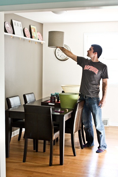
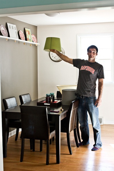
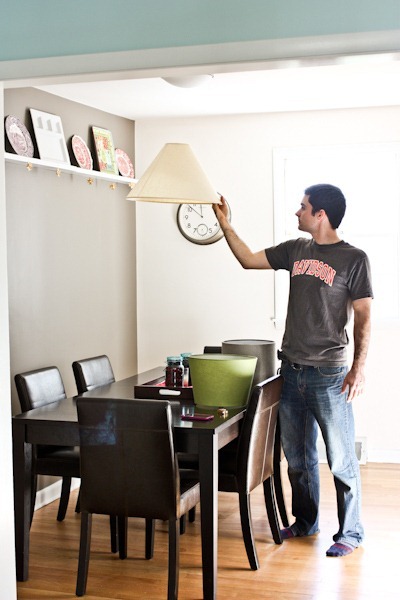
We tested out some of our lamp shades to get a feel for the space. We were thinking white/neutral but this test made me realize how much I would like some color! [Note the sizes are too small]
The cream is just kind of boring to me..
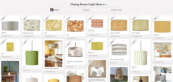
Check out my Pinterest board to weigh in on your favorite!
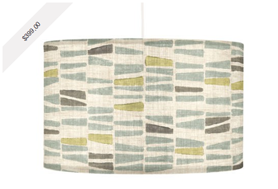
I am leaning towards this one via Roomandboard.com
But I also love love love this via 2modern.com
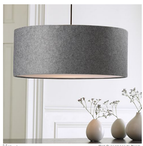
And Karen’s vote is for this classic (which happens to be the biggest and least expensive – a plus) via Westelm.com.
I’ve been debating lights while Matt has been drumming up some beer juice
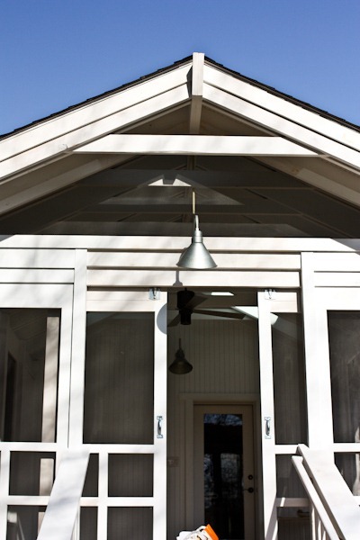
Porch painted white!
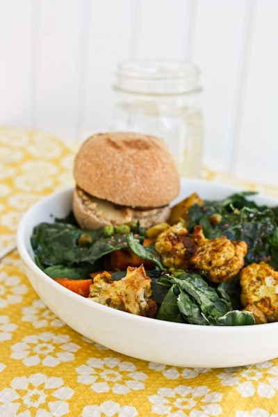
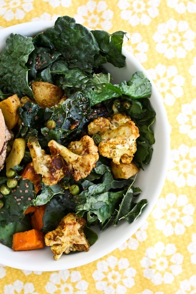
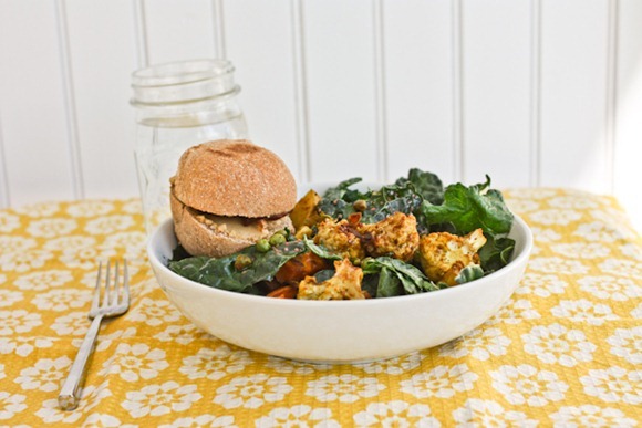
Lunchtime bowl
A mixed veggie salad made with cauliflower, sweet potato, beets, kale, spinach, salt and olive oil
And a Honey Whole Wheat roll stuffed with peanut butter cookie dough hummus and jam. It made a pretty killer PB&J look-alike!
So…which shade would you choose!?






Hillary says
Definitely the first one (the blue and green). I think it would look great in that room!
Allie@LiveLaughEat says
Am I seeing things correctly? $400 for a lamp shade? I’ve never bought a lampshade…and well maybe I never will!! That one is very beautiful though…so KERF.
KathEats says
Yes, unfortunately house things like this can really get expensive. And this does include the light + hardware – not just the shade. Anything under $500 is a pretty good price – some of the fixtures I looked at were like $2000!!
Sana says
Jeeeez. I feel like being an adult is just $$$.
Erin says
It is! And being a parent is even more $$$! I had no idea! 🙂
Katie @ Peace Love and Oats says
I’d have to go with Karen on this one!
Anjali Shah @ The Picky Eater says
Love the westelm one!
Emily says
I like the last large grey one too.. It seems like u have a big space to fill. The grey is modern, not too busy. Your right the white is too bla. And if you want to pop color you can use place mats and chargers.
Amanda says
I really like that first lamp shade. It’s got some interest with the pattern and colors, but it’s still pretty subtle so it shouldn’t completely dominate the space.
…but $400? Yikes. I had no idea they were so expensive. Choose wisely. 🙂
lynn @ the actor's diet says
i’m such a pinterist addict!
Jen says
I like the first picture you posted. A bigger version of that one would be awesome.
Kelly says
i LOVE the big gray one! that would look amazing! 🙂
Laura says
LOVE the Westelm shade!!! Looks perfect in the space. Makes a statement, but blends in beautiful with the rest of the space
Chris says
Love the westelm choice. It looks like it would be the right size and adds color but doesn’t overpower.
Lisa (bakebikeblog) says
I love the green one!
Stella says
You can’t go wrong with color!
Lorie says
Ooh! Love the first one you like–the grayish-blue and green combo is EXCELLENT! And, I think would work best as a “neutral pattern” with other patterns you may introduce via tablecloths/placemats…
So exciting to decorate a new home!!
Annette @ EnjoyYourHealthyLife says
Holy pricey shades!!
I like Karen’s pick the best. FOR sure.
Zoe @ loseweightandgainhealth says
I need to sit down after seeing the price of those lights! They are all lovely – happy choosing!
Maria @ Sinfully Nutritious says
I LOVE THE FIRST SHADE
kristen @ verbs and vignettes says
i like the green one from 2modern! and color me jealous that matt’s outside in a t-shirt. 🙂 jersey has been COLD this weekend. full-winter-coat-cold.
Sarena (The Non-Dairy Queen) says
Ugh, I’m having the same problem right now with lighting. We have had the same lamps forever and we really need to do something new. I like Karen’s pick the most…I think. I’m really in to big and chunky additions lately. Lunch looks killer! Good luck deciding!
Laura (Blogging Over Thyme) says
Love Karen’s favorite! I am obsessed with these globe pendants from West Elm, that I saw in the store yesterday–but the store ones had tall Edison style bulbs (which I LOVE!). Maybe two hanging above the table would be nice!
http://www.westelm.com/products/globe-pendant-a563/?pkey=cpendant-lighting
KathEats says
I LOOOVE that but determined it’s not ideal for me because it’s not diffused and therefore too harsh for nightly meal photography 🙁
Gwen says
I think the gray West Elm one will stand the test of time. It is classic, but not boring, due to the good gray color; I also like the shape of that shade the best.
faith says
I second that. You may outgrow the other two but the gray is classic.
AJ says
Third
Kathy W. says
fourth, for those reasons & because it will never clash with any bright/bold table settings or patterns–from blues & greens to orange & reds…even if you went crazy & did a Valentine’s pink table, it would go with it! 🙂
Karen says
Fifth…the shape and shade of gray make it interesting and modern, though it’s also got the advantage of being classic and neutral. (I like the first one a lot as well, but worry re. the pattern. The second is too busy.)
Abby @ Abz 'n' Oats says
I like the green one the best! 🙂
jk says
Funny, I picked the one Karen did before I realized she had chosen the grey one.
The green ones are a nice choice as well but the grey is just a classic.
But then, it’s all about what you like.
Love your house. You have a great eye for detail.
Sondra says
I agree with Karen!
katie @KatieDid says
I love the pop of color from the green, which pulls out the colors in those plates lining the ceiling. I love the second one from 2modern a lot.
Krissy says
love the westelm classic. makes me want to redo some lighting in my own house!
Kate @ PastaFreeRunner says
I vote for the 2modern lamp shade. I LOVE the splash of color
olivewineandfood says
i like the big gray one too : ), and it’s way cheaper!
Averie @ Love Veggies and Yoga says
I love love West Elm in general. Most of my house has been re-done in the past 5 yrs and is now largely West Elm but knowing you, your color vibe, even the colors you use on your blog…I would say the Room & Board shades just fit you.
Any of the ones with the green seem so you.
Me personally, I’d go with the brown damask one from R & B but I know you tend to like the muted greens. All are pretty; you can’t go wrong!
Ida says
I love either the first one, or the oversized grey horizontal stripe one from 2modern, that would be killer in that space. Have fun with your choice. Decorating is my passion. Loveeeeee your blog.
Kylie says
I would go with the one from Room & Board or anything that’s green, or yellow. It goes with the color of your walls nicely. Maybe even an orange since your antique plates would tie in great with it. It will look great whichever one you choose.
Jessica L. says
You’re pretty crafty, Kath, I’m betting you could always buy a big cheapie and cover it with your own fabric! I bet there’s an article somewhere on pinterest :). Otherwise, I’m a classic kind of girl and go for the ones at West Elm or Ballard Designs. Can’t wait to see what you choose!
KathEats says
I should do this. I just fear my DIY would fall apart in a matter of weeks. I’ve thought about buying simple and then adding ribbons!
MaryBe@Accidentally-Vegan says
Pinterest is an evil time sucker – I love it! All your pins are great, I like the same one as karen
Kristel says
I like the big grey one too! Great shape, classic but mod.
Jen says
I LOVE the green one, but I feel like Karen’s choice would give you a wider spray of light. Tough call!
Fran@ Broken Cookies Don't Count says
Sounds like a delicious lunch! I like the green shade, I agree that the room could probably use a touch of color. I like all of the shades though. I like the style.
Simply Life says
love them all! I’d pick either the green one or Karen’s pick!
babs says
dang! all very cute. but I had no idea that drum lights would cost so much! I’m a fan of any of the ones with green in them
Bee @ Icky Bee's Piece O' Cake says
I like the shape of Karen’s favorite, but not the color. I love the color of the green one, but not the shape! I don’t think that is going to help you at all.
Roxanne says
Yes, the color of the green one is great, it just pops, but wish it was in a different shape!
J3nn (Jenn's Menu and Lifestyle Blog) says
You’re right, color is so much better! I really like the 2modern and Westelm one. Tres chic!
Cat says
I’m with Karen too! Even thought it’s grey, the felt adds nice texture. I also agree that a bigger fixture adds more elegance to a dinning room. And as a designer friend once told me “grey flatters everyone and goes well with everything!”. I took those words and I ran with ’em..love grey!
Kelsey says
I love the first + third.. I think the second super fun.. but is the wrong shape for the space….
Susan H. @ the food allergy chronicles says
I love the Westelm! I love the size, shape and colour! The Charcoal Grey colour will help anchor the room…close enough to black. Also love the fact, it looks like it has some texture. Good luck choosing!
Ellie says
I like Karen’s choice — very classy!
Or you can make your own — find a cheap basic shade that’s the right size/shape for you and cover it with fabric of your choosing. Custom and CHEAP! 🙂
Ashley @ My Food 'N' Fitness Diaries says
man oh man, i can see why you’d have a difficult time choosing! i love all three that you mentioned, but the green 2modern.com one is my favorite. i think it also looks very “KERF”! 😉 it just seems to fit you after seeing all of your other home decor. i do also like karen’s pick a lot too… classy but unique!
Mari says
Go with Karen’s pick, the color/texture will look great with the accent wall. A lot of sophisticated design employs similar colors in different tones and textures. The grey is classic. The green is a little too cutesy for me!
Lauren @ What Lauren Likes says
I like all of them! The green one though is my fave 😀
Sarah says
Kath,
I’ve been reading your blog for two years, and I love it: the pictures, the writing, the moderation, etc. Plus, one of my very best friends is a Davidson grad, so you know…I’m wondering whether Matt or you know of any artisan bread-making or baking internships, or where I might find out about such things? I am in Colorado and would love love love to do a baking internship. I’ve researched Great Harvests here, but I can’t seem to find what I’m looking for. Any insider tips?
Cheers,
Sarah
KathEats says
Hey Sarah, Thanks for reading!
Unfortunately I don’t know of any formal internships in the bread biz. Have you spoken to GH owners and they don’t have what you need or you can’t find them? I know they are in CO!
Kelly says
Sarah, not sure what your background is, but my guess is that most internships would tend to go to culinary students who are studying pastry since an owner might not want to teach someone all the basics. That said, assuming you are not a culinary student, I would see if you could do some informational interviews with bakery owners in your area. Instead of approaching them right off the bat asking for an internship, ask instead if you can buy them coffee to talk about what they do. That opens the door to start building relationships and ask for an internship when appropriate.
Brittnie (A Joy Renewed) says
I would choose the Paper Cloud – Buds Pendant green shade. It is the perfect size, shape and I agree that the space would look awesome with that pop of color. 🙂
Christine @ Oatmeal in my Bowl says
I think more people should eat cauliflower. Looks delicious!
I love the green shade you were trying out. So, I’d have to go with the green shade in your final choices. 😉
Maria says
I think I would have to go with Karen’s pick, as well. Love the colors in the first choice, but for the long run, I believe the classic color choice would be the best. I’m so happy for all the wonderful things coming your way. 🙂
I’ve noticed your beautiful serving tray on your dining table several times and love it. Any ideas on where to look for one similar? Thanks, Kath.
KathEats says
Thanks, it was a wedding gift from Pottery Barn
Lauren @ Oatmeal after Spinning says
I know everyone’s weighing in on the lampshades, but I’m distracted by something else. What’s on the cauliflower?? Paprika? It looks awesome!
KathEats says
🙂 It’s Cracklin’ Cauliflower – MamaPea’s recipe. I made it for dinner a few nights ago
Jamie @ Don't Forget the Cinnamon says
I loooooooooooooove the first one!
seana says
4th top row from left. I think the orange/reddish color would be a nice contrast with the gray wall. As long as it doesn’t clash with your dinnerware.
jenna k says
I think the grey looks really great, but if you want to go with color, I would lean more toward red to bring out the red in the plates on your shelf. The green shade you like is gorgeous, but I think green looks kind of random in the room- at least from that view.
Ashley @ Coffee Cake and Cardio says
I like Karen’s pic too! It’s timeless.
Ann says
I love all of them, but I think I would get tired of the pattern on the first one and the green doesn’t seem to match the color of the walls. I think you would definitely be playing it safe with the third one, but you could bring color into the room in lots of other ways and you probably won’t get tired of it.
Jen says
Ditto this.
Betty says
If you haven’t come across Seascape lamps, have a look there. We’re very happy with some lamps from them (great quality; you won’t go back to PB) and they have some beautiful fabric drum shades. I think I even saw some green prints that remind me of your chair. You could also buy a quality fixture and then find and fun shade on Etsy. Have fun! http://www.seascapelamps.com/
KathEats says
TOO MANY CHOICES!!!!! But thanks for sending this!
Molly A says
I like the third or fourth one in the first row…nice pop of color in the dining room. Lighting fixtures is one of the most expensive parts about owning a house. When I bought my house I replaced all the light fixtures and it was EXPENSIVE! So, don’t feel bad about the judgy judgersons making comments about the cost.
Laura I. says
I don’t think commenting with shock at the cost of a $400 lamp shade makes someone a judgy judgerson. That’s a lot of money to a lot of people. If it’s worth it to Kath, there’s obviously nothing wrong with it; but people who can’t afford something like that are entitled to their discomfort, too!
Shannon @ My Place In The Race says
I love the green one with the little leaves! Too cute! 😀
Leslie says
I like Karen’s choice best. Good scale, classic, timeless design, will match all colors that you bring to the room, will be better choice for resale when the time comes. Karen has a good eye. You’ve shown pictures of her homes in the past and she has good taste. Any of the choices you’ve shown would be lovely. I would rather see you use a more neutral shade and use linens, dishes, center pieces, etc for your pop of color. The dark grey shade looks great with the gray walls of the room.
Aimee says
IAWTC. Get your color fix from more transitional pieces!
Laura says
The Green (2modern.com) one for sure, it is so cute!
Katie @ Arugulovers says
I like all of the ones with a floral design, especially anything green 🙂
I do like Karen’s choice as well.
Good luck!
Pat says
I love the green one from 2modern!
Angel7 says
Oh, Kath… I think the “So Many Jars” lights at Pottery Barn is so you! It is sooo cool, and reminds me of how you like Ball jars! I like your picks, though!
http://faithfulsolutions.blogspot.com/
Melissa says
Just checked this out. I agree; it does look like something Kath would like and I think it would look cool above the rectangular table!
Jessica says
I love the first one- that’s my vote. I really love your style and I think it fits right in.
Patricia says
I like the size and shape of Karen’s but would prefer it in green.
Caroline says
I love the “Galbraith & Paul Zinnia Pendant” flowery shade on your Pinterest board! I say go with that one!
Gina @ Running to the Kitchen says
I love the gray one that Karen likes! Especially, the shape and size (although that’s hard to tell in the picture, but it looks big :))
Kristy says
I have the West Elm one in white. Love it plus it’s a steal compared to others!
Meagan says
I like Karen’s pick. The silver goes well with that cool silver clock on the wall.
Janelle says
Karens a wise women !! Love it !!
Leah says
easily choice three. You can always add colour elsewhere.
Kiran @ KiranTarun.com says
Love Karen’s choice!! 🙂
Khushboo says
Wow when did lamp shades become so $$$! I love Karen’s selection!
Ulya @ Kitchen Impromptu says
I’d say green! The table and the walls are neutral, so green would bring life to your dinner corner.
Heather says
I like the Room and Board one or Karen’s Choice. There are both definitely the right shape…I feel like you need something kind of oblong in that space. Either would be beautiful.
Elisabeth says
Grey is one of my favorite colors, so I actually like Karen’s choice best, but also love the first one 🙂
Kelly says
Yeah, I feel like lighting fixtures can get so expensive. When I was looking at condos a lot of them had fixtures so pricy that the owners wanted to take them with them vs. selling them with the house. I fell in love with a condo that had this amazing fixture in the dining room:
http://www.restorationhardware.com/catalog/product/product.jsp?productId=prod1619196&categoryId=cat1701013
So gorgeous. If it were me, I’d probably go with something more classic/transitional having seen your house tours. It seems like most of the stuff is in that style so something very graphic or modern IMO would feel a bit out of place. I also like the more neutral one because it gives you more opportunities to accessorize your table. A more colorful one IMO makes it then a bit more limiting when you want to switch out different linens and table cloths say for the holidays. I try to do my pops of color on things that are easier to change out (i.e. vases, pillows, napkins, etc.) because it gives me more opportunities to switch things up for less.
Kim Weigand says
Kath,
Have you thought about a large rectangle for more light coverage on your table since your table is rectangle? And, you could probably make your own shade and just purchase the light kit. Should be fairly easy.
Kim
KathEats says
We have thought about a rectangle (actually that’s what we originally wanted) but I haven’t been able to find many I like. I’m really just not that crafty!
Melissa says
I’m more intrigued by the peanut butter cookie dough hummus. Is that something you made and shared a recipe or was it purchased? Sorry if I missed it in another post.
KathEats says
Yup it was here: https://www.katheats.com/ive-created-a-monster