I went to a panel on blog design this morning – it was really helpful to hear two designers/bloggers talk about what works and what doesn’t.
Notes
- Ideal sizing: Post area 640 px | Sidebar 320 px
- Size photos to 72 dpi, which is the highest the internet goes to optimize load time
- Match your photo size to your blog photo size (rather than a super large photo that you insert into your blog at only 400 px)
- Minimize the use of badges on your precious sidebar space
- Strive for originality, personality and functionality
- Save photos as “JPG Medium” in Photoshop
- Smoosh It plugin will resize WordPress photos if you used to blog with files that were huge (before you knew better!)
- Dafont.com is a great place to go for fonts
- Just because you have a font on your computer doesn’t mean everyone can see it – use web safe fonts (Google that for a list)
- The Blog Designer Network is a great place to get help
- Adobe Kuler is cool for color design
I felt that KERF got a pretty good rating based on what they said, but I definitely have some small changes I’d like to make. Do you have any recommendations?
I was more than hungry for lunch when the session was over! And very very happy to see a salad bar again
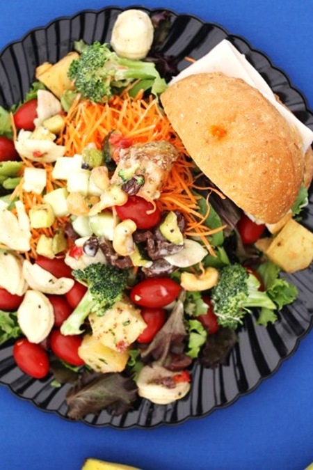
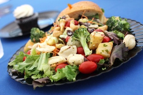
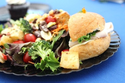
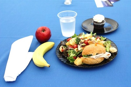
I piled my mixed greens with tomatoes, cucumber, carrots, pasta salad, potato salad and broccoli salad.
Plus a half a turkey + swiss sandwich on the side –
Lunch companions today were Iowa Girl Eats and Latte Love!
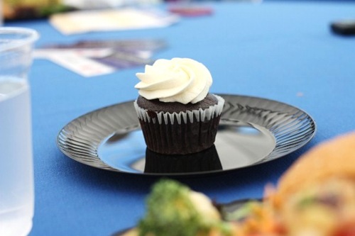
For dessert, Miss Iowa and I shared this [vegan] cupcake! She loved it, I loved the icing but not the cake. Storyofmylife.
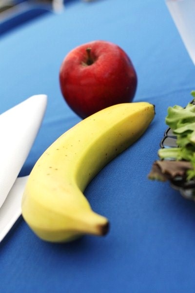
I finished lunch with half a mealy apple and snagged a banana for breakfast!!
I have a few afternoon delights – a session on multimedia blogging (I’m obsessed with getting a new phone with a better camera and bigger screen), a walk with some blends and dinner with American Express and financial expert Manisha Thakor!



Kristin @ eat healthy. be happy. live well. says
Thanks for sharing the info from the session! I’m still new to this whole thing and trying to size pictures is one of the things I need to work on!
Can’t wait to see what changes you end up making!
Callie says
Aahh! I love Katie from Latte Love! I’ve been reading her blog since her Weddingbee days!
Vicki says
Hi Kath!
I’m a designer, so I have a couple of recommendations 🙂
Mainly, you might consider having only one sidebar, not two, as it’s a bit visually confusing. There is so much colour and text everywhere that the eye flits between all 3 columns and doesn’t know where to focus. If you had just the right sidebar I believe that your blog posts would be easier to read, as we are inclined to read from left to right, and the left sidebar makes that movement a bit jarring.
Also, I didn’t see a copyright notice anywhere , so you might like to insert one into your footer 🙂
Hope that is helpful!
J3nn (Jenn's Menu and Lifestyle Blog) says
I’m a designer too and I agree with 2 sidebars. Three used to be WordPress default and trendy, but now wide open spaces is where it’s at!
KathEats says
Jenn, you mean you like 2 sidebars or just 1?
J3nn (Jenn's Menu and Lifestyle Blog) says
Sorry, I meant two COLUMNS, not sidebars! So one main column and one sidebar column. 🙂 That’s the layout that I plan to switch my bog to, sort of like Tina’s only I’m not going to stack my sponsor banners, I’ll do one horizontal banner on top like Fitnessista’s and one sidebar banner.
Kath says
Gotcha. I don’t think I could handle the wide box ad – it’s so …boxy!
Baking N Books says
I’ve always wondered if 2 or 1 side-bar was “nicer” or ‘better’ – but it seems like some bloggers – like Kath – have a lot of info and their banners on the sides…would that not be “too much” in just one side-bar to scroll through?
On another note – I just have to say Kath – that you definitely know how to do up salads – so happy it’s not just lettuce. Kath Eats Real Salads 🙂
KathEats says
🙂
I agree – my content wouldn’t fit on just one!
KathEats says
Thanks Vicki! I just tried content on the left and liked it – but I noticed a few bugs, and my footer didn’t look very good.
Also, isn’t copyright assumed, or do I really need it!?
Vicki says
Yes, copyright is assumed, but in the unlikely case that anyone were to steal any of your work and claim as their own, you’d be able to put together a better case to sue them. The copyright symbol publicly informs that you hold copyright on this blog and its content, so the person that stole your content cannot claim innocent infringement as a defence.
It’s not necessary, but might be worth doing as you earn money from your blog 🙂
KathEats says
Cool – I’ll put it on my to do list
Cait @ Cait hates Cake says
Thanks for sharing those design tips!!
chelsey @ clean eating chelsey says
That seems like an interesting session! I just got my blog redesigned (Ryan @ No More Bacon!) and I think he did a great job. I have all my sidebars on one side so it’s not confusing for others!
KathEats says
He did a great job! Love your header
Kristen, Sweetly says
Like the notes! No recommendations… Vicki’s suggestion for the one sidebar might be a clean option to try.
I love watching the different changes you make to KERF! The banner work was my favorite progression to see.
Halley (Blunder Construction) says
Thanks for sharing this advice. I think the badges notes was interesting, I had been tossing around the idea of more or less in my sidebar.
RunEatRepeat says
I knew those apples were going to be mealy and I still grabbed one…
Val @ Balancing Val says
I always have trouble with picture sizing.
I tend to like blogs with the columns on one side rather than framing the blog. To me it feels more like the post content gets clean attention if that makes sense.
Nicole says
My only problem with the design of your blog is that I have to scroll through all the comments to click through to the previous/next post. It’s a minor detail, but it’d be nice if going from post to post was more streamlined.
KathEats says
I know this is a problem people have mentioned in the past. I tried to move it but got stuck. I actually use the “END” and “HOME” buttons so I just all the way to the bottom of the page when I’m using my own site. If it were inbetween my content and comments, you’d have to find it with the scroll bar, which is kinda hard to do. So give the end button a try and see if that’s easy enough?
Nicole says
I guess, since I’m almost always viewing your blog on my iPhone, this solution never occurred to me since there are no HOME and END buttons.
This definitely is not a deal-breaker (I think you have the most interesting healthy living blog I’ve found) but since you were taking suggestions, I figured I’d bring it up. 🙂
KathEats says
Ahhh…that is definitely not something I thought about. I guess I could put them BOTH places? I tried once and failed – I’m really not that tech saavy!
kaila @ healthy helper! says
Those are such great tips to keep in mind!!! Thanks!!
Lauren @ What Lauren Likes says
Sounds really interesting! I am always looking for cool tips on how to make my blog better! You certainly know how to build a salad! haha 🙂
Cait's Plate says
Yesss – love the tips, keep ’em comin’ 😉
That cupcake looks so good – it’s a bummer it wasn’t all that good. At least the icing on top was tasty!
Also I have the Samsung Fascinate and am really happy with the camera on it – not sure if you want the Android platform but I’m really happy with it!
Margo @ peanut butter trees says
Great blog tips! And the salad looks pretty good too.
Sarena (The Non-Dairy Queen) says
Sounds like a great morning! Lunch looks delicious! Have fun tonight!
Ali says
I actually preferred the 2 sidebars! Not so much of a fan with everything on the right…
KathEats says
I like how it feels balanced and more like a website?
Sara says
I’ve always really liked the layout of your blog with content in the middle. I like it much better than 2 columns!
Meredith says
I agree, I like the 2 sidebars better!
lynn @ the actor's diet says
thanks for the blog tips! i always take notes but i never implement 🙁
Baking N Books says
lol ditto…i don’t even have my own domain…I still feel like I want to change my blog’s name – and have no idea of it’s direction or ‘purpose’ so to speak. So i’m 🙁 with ya. 😉
rumfunandsun says
When I saw the salad I instantly thought ” hello beautiful”!!!
Sounds very informative thanks for passing along some of the info!
J3nn (Jenn's Menu and Lifestyle Blog) says
Heh, I already do most of everything in the tips list! 🙂 But then again, design is what I do. I’m pretty bad with too many badges and stuff, though. I’m redesigning my blog with more simplicity and spaciousness.
That salad looks wonderful! Love salads you can design yourself. 😀
Ashley @ Coffee Cake and Cardio says
Thank you for posting your notes from the session!!
Mary @ Bites and Bliss says
Thank you for those tips! I didn’t know some of them. Very helpful. 🙂
Katie @ Changing Patterns says
Wow, sounds like you are having so much fun! I just started my blog so I m soaking up all the info you’re sharing 🙂
Averie @ Love Veggies and Yoga says
Kath, thank you for the tips!
I have been posting photography tips this week that I learned in at my conference earlier this week from the basics to my latest post, Restaurant Photography Tips.
I already knew the 72dpi (but only for a few months)..before that I was exporting my files from Lightroom at MUCH bigger sizes
SmooshIt, cool!
640px wide…see the issue with many blogs like yours and mine which have center columns and then 2 sidebars flanking the center (rather than other blogs say like Angela’s which have their main part on the left and then the sidebar stuff is all on the right)…the center “table” or column is usually a max of about 620px, tops. Usually 600. I would love to bump mine up to 640 but it’s a design limitation I went over and over and over with my blog designer person on and she said I’d have to change to a different layout, i.e.like Angela’s if I wanted wider pics.
Sorry to type a bible out there..lol..this is just something I think about All the time!
And I use DaFont, too
Thanks for those links, super helpful! I need to email you too 🙂
KathEats says
Yeah, I think 640 might be a bit too big too
Sara says
Your napkin and banana look like they are forming a “K” – for Kerf! (and Kath.)
KathEats says
🙂
Katelyn @ Chef Katelyn says
Those recommendations are going to help me maaaajor. One recommendation I have: The white background outside of your header and post area would look beautiful with a matching photo background (matching your header, that is) a quarter inch or so outside of your sidebar space. It would give KERF some good body!
KathEats says
Do you mean like a frame? I’m not sure I could do that! I also like white backgrounds…but I agree it would be chic
Katelyn @ Chef Katelyn says
If you’re on self-hosted wordpress (which I am), you can choose a “background” and I was able to tweak my HTML so that the background didn’t start until a quarter inch or so outside of the sidebar area. If you contact a techy person they should forsure be able to help!
KathEats says
I don’t see a background on yours??
Sophie says
Kath – Totally offtopic (I am design-challenged. Let me just say I love your bright colors and your outside food photos and don’t think you need to change a thing!!).
But – how are Matt and Great Harvest making out without you?
KathEats says
🙂
He’s doing well!! Two good days of sales
Alaina says
I love your site! I’m looking to redesign my blog (Blog Fairy) and she asks what blogs we admire and I put down your’s and Emily’s (Daily Garnish).
Thank you for the great tips too!! 🙂
KathEats says
Aw thanks 😉
Angel7 says
You had a lot going on on your salad — many different foods, and all good 🙂
http://faithfulsolutions.blogspot.com/
Elizabeth @ RunWithSneakers says
I was at that session too. Very informative but the room was way too small for the crowd in there. Darn, I wanted to meet you.
KathEats says
Aw sorry I missed you!
Lindsey says
Great tips, thanks for sharing!
I love dafont!
Kathleen @ KatsHealthCorner says
I LOVE THOSE TIPS! Thank you so much for sharing your notes with us! 🙂 Your salad looks to die for!
Gina @ Running to the Kitchen says
I actually like the 3 column layout. I think it “frames” the content well. As long as you keep the sidebars clean (which you do a great job at doing) and not too busy, I prefer it over the one-sided layout. To me, when you put two sidebars next to each other, the ads and badges, and widgets just start to look cluttered.
The photo tips were great. I didn’t know that stuff. I was uploading my pics at 4+MB (the size they are coming off my camera at), knowing I should resize them first is quite helpful!
KathEats says
I agree! I think that’s why I moved them back. It feels balanced
Nikki (Picky Nikki) says
Great info Kath! I will be changing my photo uploading practices I think! I tend to just upload from iphoto, and do not change the sizes at all… Oops! Please keep sharing all the great info you are learning!
Hannah says
Oh no, those tips panic me because I don’t know what half of them mean! Smoosh it? I’ve heard lots about that recently, but don’t get it!
Lexi @ A Spoonful of Sunshine says
I’m going to agree with Hannah here. All these tips seem really helpful, but I’m not actually 100% sure what all of them mean. For instance, I’ve heard the name “SmooshIt” (awesome name btw!) but have no idea what it really does and how it makes photos different than normal ones…
#newbieblogger 🙂
KathEats says
I’m not 100% sure either!! Smoosh resizes photos that are large and makes pageloading take a really long time. I’m not sure how to work it though!
Chelsey @ Chew with Your Mouth Open says
Interesting information! I wish we had more bloggers conferences out here in Seattle. I will definitely use the information you shared! Thank you!
Khushboo says
Thanks for sharing tips from the session- v helpful!
Aine @ Something to Chew Over says
Great tips, thanks for sharing Kath!
Chelsea @ One Healthy Munchkin says
Thanks for the tips! I never really gave much thought to blog design since Blogger pretty much does it for me. But I’d like to get my own domain eventually so I’ll have to remember this post!
Maria @ Beautiful Busy Bee says
I love your blog how it is!!!! Of course half of those tips sounding like martian to me, which is probably a bad thing considering I have a blog.
Dani says
Yay!!! I love IGE!! I hope you guys hit it off!! You two are definitely in my top 3 favorite blogs!!!!
Fancy says
Hey Kath!
I am so behind on your blog…just catching up on past posts and I actually do have a suggestion since you asked. It would be so much easier for people like me (who have lots of catching up to do) if you had a feature on each post where we could just click “next post” rather than having to go back and forth to read them all in order. Does that make sense? We would be able to catch up so much faster…other than that, I think everything about your blog is wonderful 🙂
KathEats says
If you hit the END key on your keyboard you can quickly jump to the bottom and see them. Look right below this comment –>