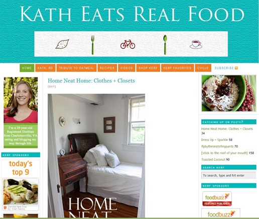
I’ve got the design itch again.
A few hours of work and I decided (with the help of Twitter) that I didn’t love either one.
Thoughts?
And unfortunately the design itch warps time. Before I knew it it was 1PM and I hadn’t done any yoga as planned or taken a shower!
Yoga has been rescheduled for this afternoon and I did indeed shower today
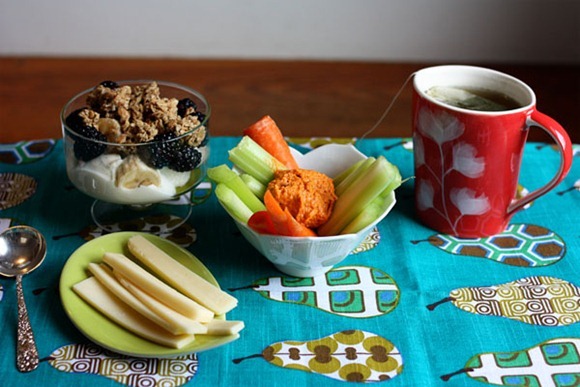
Lunch was an assortment that had me questioning if it would be filling, but it sure was!
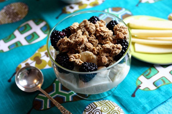
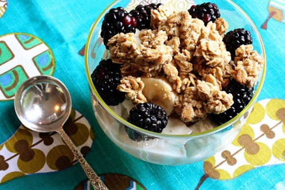
All I knew I wanted was a yogurt parfait
Siggi’s Passionfruit (it was on sale again!) with Ancient grains granola, blackberries and half a banana
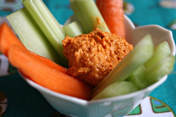
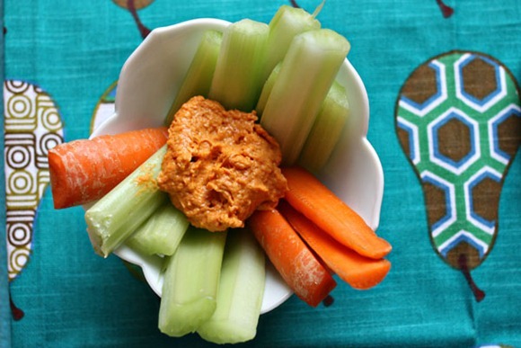
Some veg – C+C with some red pepper hummus (which I really like! I rarely like store-bought hummus)
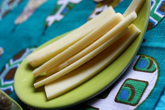
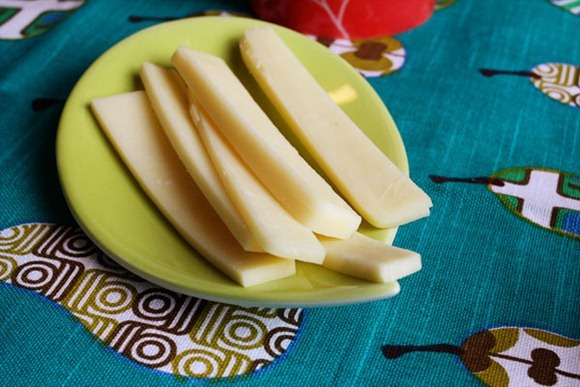
CHEESE!! My favorite Organic Valley sharp cheddar. It’s the best!
So many people (including myself at times) think of cheese as a calorie-dense condiment and a food that “adds up fast” at buffets. But we must remember it is calcium and protein and tastes delicious!
More mint
I’ve got a yoga class and dinner out with a bunch of girlfriends – and lots of walking in between to get there!



Tina @ Faith Fitness Fun says
I love your current header in all honesty. It’s gorgeous!!!
AJ says
Me too, Tina!
Jessica @ How Sweet It Is says
I love your current one, but I also like the one with the teal background. But that’s because I really love that color.
Mrs A says
i like your current one the best 🙂
Katy (The Singing Runner) says
I love your current header!!! But the other two are nice too!
Dorry says
I get the design itch all the time! I haven’t had time to devote to it, but I see a new header in my future. I’m very visual and like to switch things up. I do LOVE your current header, however.
Monique says
I actually agree with the 2 previous comments in that I do really love the current one. It’s beautiful.
Jo says
I like them both and I think you’re sooo talented, but I really love your current header. It is going to be tough to top that one!
Holly @ couchpotatoathlete says
I honestly like your current header best, but I do like the bright blue background — and maybe change the cup of coffee to a loaf of bread? 🙂
lauren says
Im new to the blog world and have learned quickly that my quest for perfection makes me want to design and rearrange all the time. Your site looks wonderful! You shouldn’t change a thing! 🙂
melissa says
i always love your tapas meals!
Averie (LoveVeggiesAndYoga) says
Glad you have yoga + girlfriends on tap!
And showers…and not taking one. Or taking one til after 1pm. That’s the life of motherhood. Some days life gets in the way of showers. They eventually happen…just not as planned 🙂
amber's notebook says
Sounds like a fun day!
I like the new headers you made!
Amber’s Notebook
Averie (LoveVeggiesAndYoga) says
oh your header…Jenn just did my site migration and she has been amazing and she did my new header for me. I really dig your current header, seriously! 🙂
KathEats says
Oh wow – new change!! I did my current header myself 🙂
Averie (LoveVeggiesAndYoga) says
you did your current header yourself?! omg you are super talented!
i just went live with my self-hosted WP site…yesterday. It’s been months in the making and there were some unforeseen glitches (aren’t there always!) but jenn’s been amazing…as im sure you know 🙂
And you are really smart NOT to go w/ intense deb. for comments. I could write you a book on all that too 🙂
Amanda (Eating Up) says
I like the header you have now!
RhodeyGirl says
I love the concept behind the new ones, but I think they need a lot of tweaking to be perfected. I understand your need for simplicity in the design- it makes sense.
I would work on finding better images than the ones you used for the bottom of the header. They don’t go perfectly well together, although they are close. The coffee cup just seems too cartoony compared to the bicycle.
I’d also like to say that I really do enjoy your current header. The right portion of the board with the herbs, peanut butter spoon, and grains is just beautiful, and the board itself speaks volumes for the words REAL FOOD. The wooden texture adds that natural element.
Anyway, those are just my thoughts! Good luck with whatever you decide!
Rebecca says
I like the first one!
Jessie says
I love your current header!
Sarena (The Non-Dairy Queen) says
I love meals like that! It is always fun to have snack lunches since you get a variety of flavors and textures!
Natasaha says
I like the current header best. I think it captures the feel of your blog perfectly.
Kate (What Kate is Cooking) says
I love both! Probably the second one more though 🙂
Heather (Heather's Dish) says
i think the designs are really beautiful but your current header is so perfect for KERF!
CMae says
The new designs read a little GOOP to me, and the thing that makes your blog so great is your originality. I love your header as is … though it could use a little Bear love, maybe!
Take a peek at GOOP — http://goop.com/
KathEats says
I love the GOOP icons!!
Amanda says
I totally thought of GOOP too! I think they are too similar.
Jess (Sweet Potato) says
I love the current header. Its eye catching!
dana @ my little celebration says
I much prefer the current design.
Estela @ Weekly Bite says
Your current header is great, but if you decide to change, the teal is my favorite 🙂
Sarah (Sarah Learns) says
i really love your current header, but i also love changing things up! i do like the new one you made, but it looks a little plain….but maybe that’s just because i compared to your current one!
Evan Thomas says
I really like the one you have with the grass background.
I think the teal color is a little too loud and doesn’t make it look as professional as the nice off-white.
Eileen says
I’m with the majority … I prefer the current KERF. Why mess with a good thing?
Cate says
Your current header gets my vote.
Samantha Angela @ Bikini Birthday says
Was your design inspired by your placemat?
Jessica says
I also like the current header as well… but what is the left picture supposed to be in the new one?
Jessica
Stephanie @ Thorns Have Roses says
I think your current header packs a bigger *statement* than today’s choices. Just bein honest!!
Lindsey @ Enjoying Healthy Foods says
I like your current header! If you have a design itch you can always design a header for me! 🙂 Ha! just kidding!!! But seriously — keep your current header!
Valerie @ City|Life|Eats says
I like your current header because it really hits home the real food component. On the other hand the new headers are simpler, and I love simplicity in headers.
Camille says
I like your current header the best!
Katie says
Your current header just screams KERF, I wouldn’t change it! 🙂
And that yogurt parfait looks delicious, especially those blackberries…yum!
anne says
I like your current header best.
Erin @Shortcut to Bliss says
Where is this pear towel from? I MUST have it!!
KathEats says
C and b!
Angela @ Eat Spin Run Repeat says
Funny you should mention your design itch because I’m in the process of redesigning my blog header! Fingers crossed, it should be up tomorrow – I hope! Your dinner tonight sounds like fun. Have a great night!
Cate says
I actually really like the header with the teal background!
I’m a pretty new KERF reader, and I’m mad at myself for not finding your blog sooner. My husband and I have always been pretty healthy eaters, but we seriously overindulged over the holidays and have been committed to eating very healthily ever since. I truly look and feel so much better when I’m eating well! Thank you for being so inspiring and for sharing your life with us.
P.S. I find that I’m a much more mindful eater when I take the time to sit down and eat, especially when I think about how my food looks as well. Do you find that staging your food for the blog makes you a more mindful eater, or no?
KathEats says
I do think it does help!
Sophie says
i like your new design. i wish it still incorporated peanutbutter somehow haha
Nicole, RD says
Cheese is worth every bit of “splurge”! Life just wouldn’t be complete without cheese!
Amanda-The Nutritionist Reviews says
I love your current one! Don’t get rid of it : )
chelsey @ clean eating chelsey says
I love your current header, but myabe you got the design itch for something more clean lined and simple because of your organizational series you’re doing!
KathEats says
Ha – probably!!
Actually I’m very clean and simple in life, so I’m not sure where the cluttered headers come from!
Mollie says
I love me some white space, so I instantly liked the first new one. It’s like a breath of fresh air!
Kjirsten- Balanced Healthy Life says
I love the first one to change things up. I love how simple and organic it feels!
Michelle (The Runner's Plate) says
I like the current header better.
I love having a variety of things to eat at my meals rather than one entree.
Kathy W. says
pear dish towel–so cute!
I love the combo of yogurt w/hard cheese on the side. As a matter of fact, I had it for lunch today! A low-fat coffee yogurt w/crumbled walnuts, a peach (imported–hadn’t had one since last summer!), and a few slices of monterey jack.
So far, I like your current logo best. The white background logo may not pop enough against the white page, but I do think the title looks better in one box with the symbols than it does with the symbols boxed off by themselves…
Anne @ butter and bear says
I like your current design the best, and I totally agree that cheese is a great splurge. I have 1/2 an ounce every night as an after dinner treat.
Liz @ Tip Top Shape says
I like that header! It is very clean and streamlined.
Anna @ Newlywed, Newly Veg says
I love your current one, but I’m also really digging the turquoise one! You can’t go wrong!
Heather @ Side of Sneakers says
I like the first one for the clean-ness and simplicity, but it’s missing your pop of color like your current header 😛
Cyclist Kate says
I love your current header but understand the itch to change things around, especially as we approach spring. However, the teal one looks a little too…generic to me. It just doesn’t scream “come on in! you will like it here!” like the current one does.
ashley says
have you read the china study at all? actually says people that consume more dairy/animal protein are at greater risk for hip fractures. says that animal protein creates an acidic imbalance in the bloodstream. the body then leeches calcium from the bones to act as a base. thus, greater incidence of hip franctures.
KathEats says
Not concerned. I eat a really balanced diet.
Mai says
I love your current header! Don’t change it! 🙂
Sarah (Running to Slow Things Down) says
I have to say I like your current header the best. It’s so much more “alive” feeling, if that makes any sense. And the colors with the oats and nut butter against the green are gorgeous and totally suit your blog to a T. 😀
(p.s. ditto on the cheese thoughts! 😀 )
Kathy @ newlywedindc says
My favorite kinds of meals are “bits and pieces” – looks great!
Kelly says
I love your header. Don’t change a thing! And showers are so overrated. So is washing your hair. I abstain as much as possible.
mary (what's cookin' with mary) says
I am in love with your current header! Infact, when you first changed it I kept thinking of how I could get mine to be like yours 😉 It’s so colorful, playful and fun!
Christin@purplebirdblog says
I’m digging on the clean look of the new header, except what is the food graphic? A sweet potato? Or a lemon? I’d make it a more distinct food, but other than that I really like it!
Sarah R says
I just had a similar yogurt parfait for a snack! Wish it was truly berry season though…
Simply Life says
hmm…I’m sure you’ll figure out the perfect fit!
Elizabeth@The Sweet Life says
Like them both, actually!
Sarah @ The Strength of Faith says
I’m totally in the minority, (please don’t stone me y’all!) but I actually like the new ones. I know it’s simple, not complicated and nothing fancy, but that almost seems cleaner and more professional. Does that make sense?
Anyway, you decide! Or perhaps bring the in the bears to deliberate. Or maybe your sweet Montana Man. 🙂
KathEats says
That’s why I like them too, but I think the majority wins and I don’t think we are in it!
Meredith (Pursuing Balance) says
I’m so bad at decision-making! They are both cute! The teal really is such a pretty color though.
Marisa @ Loser for Life says
I love your current header, Kath!
I’m craving your yogurt parfait now!
Katie says
I like your current header alot. I don’t like the others at all, stick with what you’ve got. 😉
Mary Frances says
The current header looks wonderful; however, if you have the itch for change, I would keep working on it and not use either of the two others presented. Possibly, for KERF a ‘real photograph with KERF typed onto it’ instead of an entirely graphics design–such as you have now, but just something different. Maybe photograph, bread, lots of fresh fruit and veggies, (real food), etc. in front of your brand new huge bakery ovens as the backdrop for the reverse color (white or some other contrast) lettering. Oh, and CMae had a great idea to stick bears in there somewhere–play with it. It seems to me years back you had a different header before this current one, but looking back at posts from long ago has this one. Is there anyway to preserve the header that was on the post when it first appeared to just see progressions as time goes by?
KathEats says
You can’t preserve the headers 🙁
But I do think I will just tweak the current one
michele says
I mix greek yogurt with Mini Wheat cereal squares and fruit. It fills you up and is easy to do.
Lu @ Done Dieting says
I have a serious design itch, too. I’m desperately looking for my next project. The last one I did was great, but I finished too quickly. Your lunch looks amazing! I love cheese!!
Christena says
I like the idea behind the new headers, but I don’t like the cartoon-ish pictures. The clean and simple design suits you & the blog, though. To be perfectly honest, I thought your old header (the one before this one) was the best. It was the perfect mix of personal + professional.
Marci says
Have always loved the current header. Your lunch looks really good too. Love putting together different things.
Mary @ Bites and Bliss says
I like your current header over the new idea. This one’s just so fun yet still professional.
Christina says
I really like the one with the blue background. I get that you’re going for something that’s environmental + foodie, but the leaf feels a little random, and actually the coffee cup does too. Maybe replace on of them with an apple or a banana or like a canister of oats? 🙂
Christina says
Oh, a loaf of bread! Duh!
Pearl (Crunch and Chew) says
In all honesty, I really like your current one because it’s so colorful and vibrant 🙂
J3nn (Jenn's Menu and Lifestyle Blog) says
Your lunch looks great! Blackberries are amazing.
I’m partial to your current header. 🙂 I just redesigned http://www.loveveggiesandyyoga.com — seems everyone has the design itch!!
J3nn (Jenn's Menu and Lifestyle Blog) says
Oops, http://www.loveveggiesandyoga.com typo 😳
WordPress needs an edit function for users!! 😀
KathEats says
Yes it does 🙂
Chelsea @ One Healthy Munchkin says
Ditto on cheese. It annoys me how it gets such a bad rap!
Carly says
I definitely like the current design!
Hannah says
Cheese is the bestest. And I say that even though I just blogged a raw vegan nacho cheeze… the real stuff is good too! 😛
AJ @ Flowing to Fifty says
Just reading all the comments, mine included. It seems we LOVE the creativity of your current header which is absolutely beautiful, and we don’t like change!!!
Katie B says
i personally LOVE your current heading and think it is very pretty and cute. so i say stick to the old!
wendy says
This meal set looks very appertising.
Im just starting out on a healthier eating kick and simple yet colourful meal or snacks really appeal to me.
thanks for shareing x
Laura @ Sprint 2 the Table says
I think your current header rocks!
It must be a hummus day – that was basically my lunch, but I did a spicy red pepper flake hummus. Perfect no-crash-inducing lunch! 🙂
Kristen @ That Hoosier Girl says
I love your current header, but I totally understand having the itch to mix things up! When I was little, I think I rearranged my bedroom at least once a month…I kinda feel the same way now with a blog design 🙂
Richelle says
I really like your current header, I wish I could get more creative with mine. YOur lunch looks good, I like lunches with different parts to it.
Salah@myhealthiestlifestyle says
I love the new header!!!
kristin says
You don’t want to mess with your current perfection. The green clover, the natural wooden cutting board, oats, flower….I love everything about it. I can definitely empathize with wanting a change, but I gotta tell ya – squelch those desires! I don’t know if you’re going to find a header as perfect as the current one. 🙂
Baking 'n' Books says
I read but don’t comment much – but I like your current header – it’s more “humble”…? if that makes sense…or earthy? I don’t know – they’re both beautiful and of course YOUR decision! – but I find that a bold color like the teal – you’ll get sick of it quicker probably.
But that’s just me 😉
And YES to cheese! Love it – especially Goat lately…I always thought cheddar cheese was only orange – who knew?!
Michele @ Healthy Cultivations says
I definitely like the current one better than either of the two newer ones. It’s fun to tinker around with design though. I know the feeling of that itch to do so. I’d suggest playing around with it on occasion until you come up with one that makes you say, “YES! That’s the one!!”
Kathryn @ Foodies Not Fatties says
I love the volume of less calorie dense food. The volume keeps you filled but so does that protein in that small amount of cheese! Loving all of the color too. I am thinking some of these things need to become regularly stocked items in my fridge for weekend meals! Thanks for the idea!
Katie says
I love the header you have now, but its always fun to play around, If you design any more ideas, post again, I will let you know and so will all of us readers ; ) what you love matters most though ! Hope yoga was great! xo
katiebiss says
I love your current header Kath BUT a header is a personal thing…If you are getting the itch to change it up I say go for it!
Justeen @ Blissful Baking says
Your lunch today looks like mine – a little bit of this and a little bit of that 🙂 Yum!
Alaina says
I definitely like the header you have now.
I love random lunches like that. And cheese! 🙂
Sana says
I totally love what you already have sooo much more!
Kristi says
Today’s lunch in Honduras was KERF-inspired and almost identical to yours, with the addition of a deviled egg. Thanks for the introducing me to a “tasting plate” lunch!
Lisa says
Maybe I’m in the minority but I like the current header! I think it’s cute and classy.
Sara @ myfancytuna.blogspot.com says
I love both! I actually think I might like the new one a smidgen more, just because it’s clean, simple and colorful, just like the rest of your blog (and your house, as I’m beginning to discover!). BTW, LOVE the organization series – I am logging all of your tips away for when I get my own house 😀