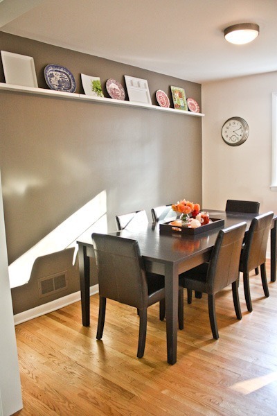
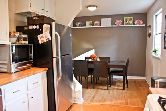
Here lies the view from the living room into the dining room where the food zone of the house begins.
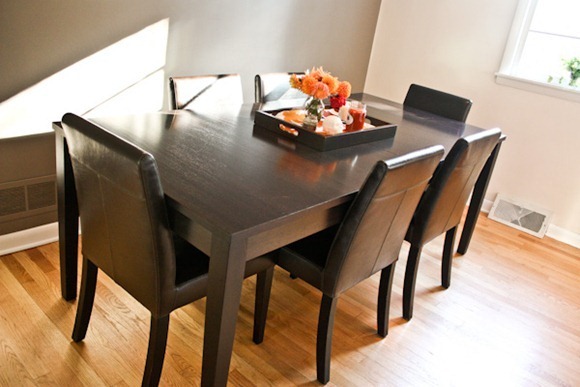
When we first toured this house, I was pretty sad to discover that the dining room isn’t exactly a room – it’s more of a pass-through, eat-in kitchen with two open walls. And I had nightmares about how tight our dining room table was going to be. The previous owners had a round table that seemed to take up more way more space than our rectangular one. So when we moved in and found our table fit perfectly, I was very very excited.
Our table is from Crate + Barrel! It expands with an insert to seat 8, although it’s pretty tight!
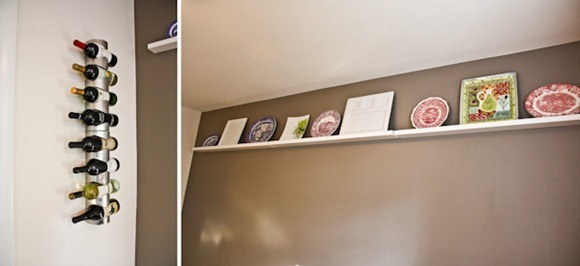
Our wine rack is from IKEA – so much more fun than the one we had on the floor for years. The display shelves are also IKEA. I knew I wanted a high-up shelf to keep my big platters and antique plates that are hard to store, and I was considering both making one myself (which sounded like a shattering disaster) and hiring a local carpenter to make one. Then I found the Ribba shelves! $15 a piece and exactly what I would have built myself. I bought 3. Done and done! They just required some heavy duty anchors and a lot of measuring (and since our wall isn’t completely flat, they aren’t perfectly aligned, but they’re 90% good enough)
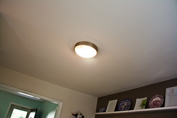
Let’s not talk about our dining room light. It’s atrocious and is on our home improvement list. We’re thinking of some kind of super modern fixture. One issue is that the light is centered to the room, not above the table, so that is taking some time to figure out.
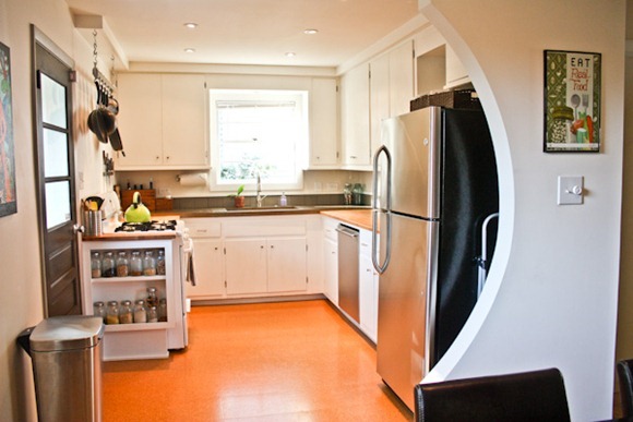
The dining room opens up right into the kitchen. This actually works great for us because we don’t have a need for a kitchen table and a dining room table – just formal is fine for us. I love the curved wall that the previous owner put in when he updated the kitchen in 2009!!
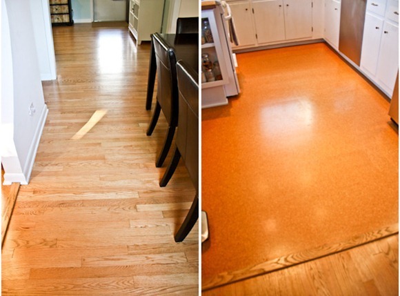
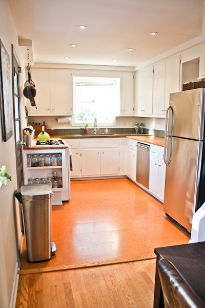
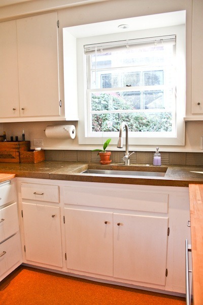
The floors in our house are a beautiful real wood, which I love, and the kitchen floor is cork, which is totally awesome because not only is it eco and springy for standing, but it doesn’t show dirt AT ALL!! There can be tons of crumbs and you can’t see them. Perfect for a kitchen!
The kitchen is light and bright thanks to two windows and recessed lights, which I love. It’s not huge, and my dream house would have an island and a whole wall of cabinets, but this kitchen actually has really great space. The work triangle is perfect and the cabinets are just the right amount for us.
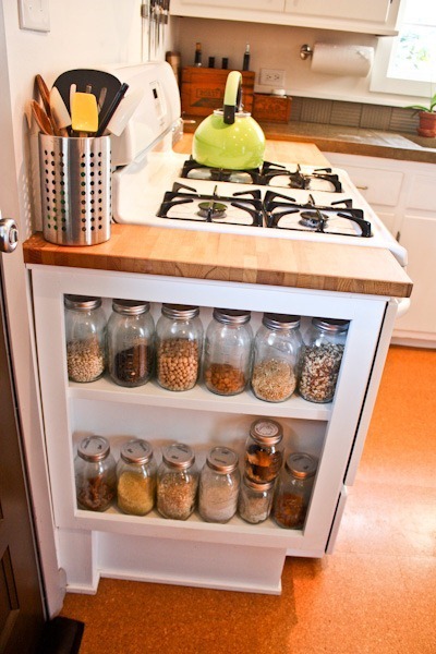
I didn’t even notice this built in shelf the first time I went in the house, but it’s got to be one of my favorite features in the house : )
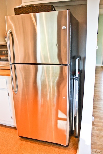
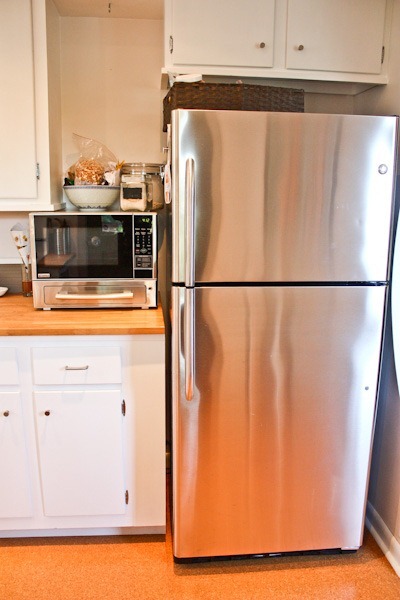
While the fridge is cool stainless, we don’t love it. Look how much wider it could be! And I would kill for a fridge with the freezer on the bottom. Our longer term plans are to get a new one, but right now that’s a want much more than a need.
The house came with this sweet little microwave – toaster combo. It’s great for toasting bread and I have to say I like having a microwave back. At first I was unsure if it would stay because of the counter space lost, but I’m glad we kept it because our oven doesn’t have much of a broiler (it’s in the bottom drawer) so this is great for all the bread we eat.
Also, see that empty space above it? One day that will hold two shelves to fit more smaller Ball jars. One day.
The basket on top of the fridge is my mini pantry – things I use all the time like nut butters and dried fruit.
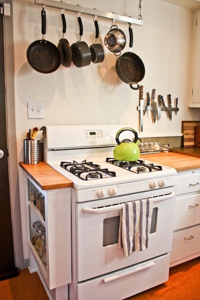
Our stove also isn’t the greatest. It doesn’t match the rest of the appliances and it’s very very basic. This is also on our “someday” list – one new commercial grade stove please!
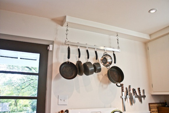
The pot rack came with the house, although I wouldn’t be surprised if it came from IKEA. I ABSOLUTELY LOVE having one!!!!!!!! It’s so great for storing and drying pots. Our knife rack is IKEA too – so handy and no counter space lost with a block.
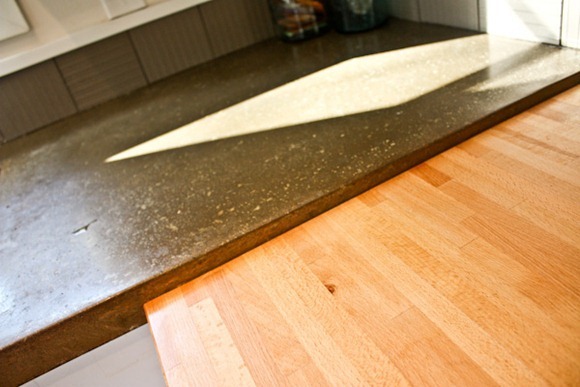
The counters in this house are a combo of concrete and wood. Most people comment how much they like the mix of materials and heights, but honestly, I would probably prefer if they were all streamlined. I’m not wild about wood counters. I do love the concrete though! And I’m happy with them as they are enough to not want to change them.
As you can see, we keep the counters as clear as possible of appliances. They are all stored in the basement pantry area or in the under cabinets.
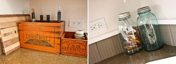
I did compromise counter space with some vintage items that make frequently-used items very accessible. Two antique boxes hold our vinegars, oils, Misto, salt + peppers. All the good cooking stuff. And our cutting board is tucked back there (in other houses we’ve stored it in the under cabinets, but I think it completes the wood theme in this kitchen). The blue Ball jars in the corner house tea – and keep the vintage look flowing.
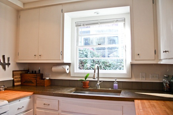
I love having our paper towel holder on the wall! Again, more free counterspace.
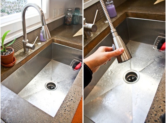
This sink was another “SOLD” feature on the house. I absolutely love it!! It’s so big and wide it can fit my whole crockpot for cleaning! Who needs two compartments anyways? Just visually divide your sink in half. I love the faucet and how it elegantly detaches to spray. Also note the little sponge holder from BB&B – it’s suctioned on (the lever style – works much better than a press-on suction). LOVE how the sponge is all tucked away and out of sight and an easy drop-spot when you’re in the middle of dishes and need a resting place for soapy, wet sponge. When I need to dry dishes, I put a cloth drying mat to the right of the sink and store it in an on-the-door rack when not in use. Therefore, no eye-sore of a dish drying rack on the counters.
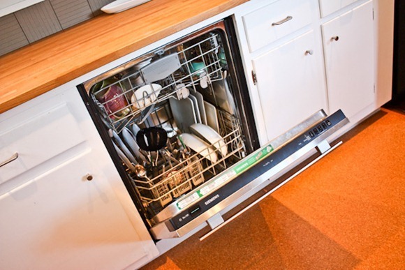
Our dishwasher is pretty awesome – by Siemens. It came with the house!
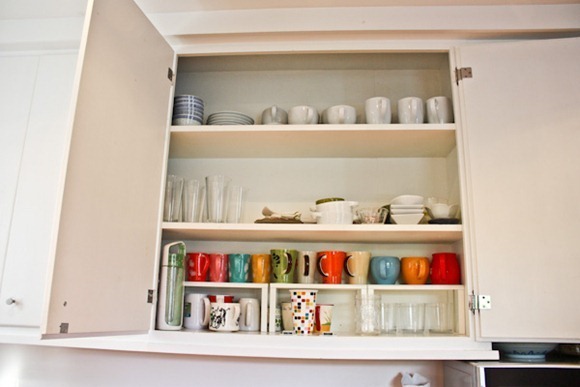
Our cabinets are pretty big and wide (although they could use a paint job!!) We have IKEA shelf dividers to make the most use of the mug/glass area.
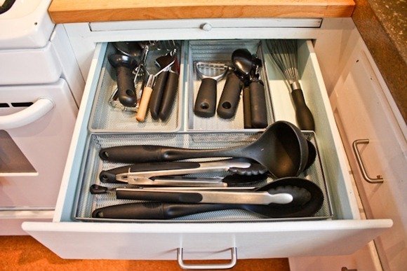
Our kitchen drawers used to be an ugly dark, stained wood. When we had the house painted upon moving in, I had our painter match the color to the living room (and if adding that on to our paint list hadn’t been so easy I would have DIYed these myself!). I smile every time I open a drawer to see the beautiful robin’s egg blue smiling back!! Of course you probably know I keep my drawers super organized : ) That’s for another post!
The view back to the dining room –
The Food Rooms
Dining room paint: sadly, it’s unknown. Came with the house.
Kitchen paint: also unknown – basic white.
Trim: Sherwin Williams Duration Low VOC acrylic latex – Extra White
Dining room table: Crate + Barrel Triad Extension Dining Table
Dining room chairs: Crate + Barrel Lowe Chocolate Leather side chair
Dining room display shelf: IKEA Ribba picture ledge
Wine rack: Vurm by IKEA
Clock: Target
Trash can: Bed, Bath and Beyond
Green tea kettle: Thrift store
Antique boxes + jars: Ebay


